Category Archives: Datavizualisation

The Little of Power BI Visualization Design – Part 2

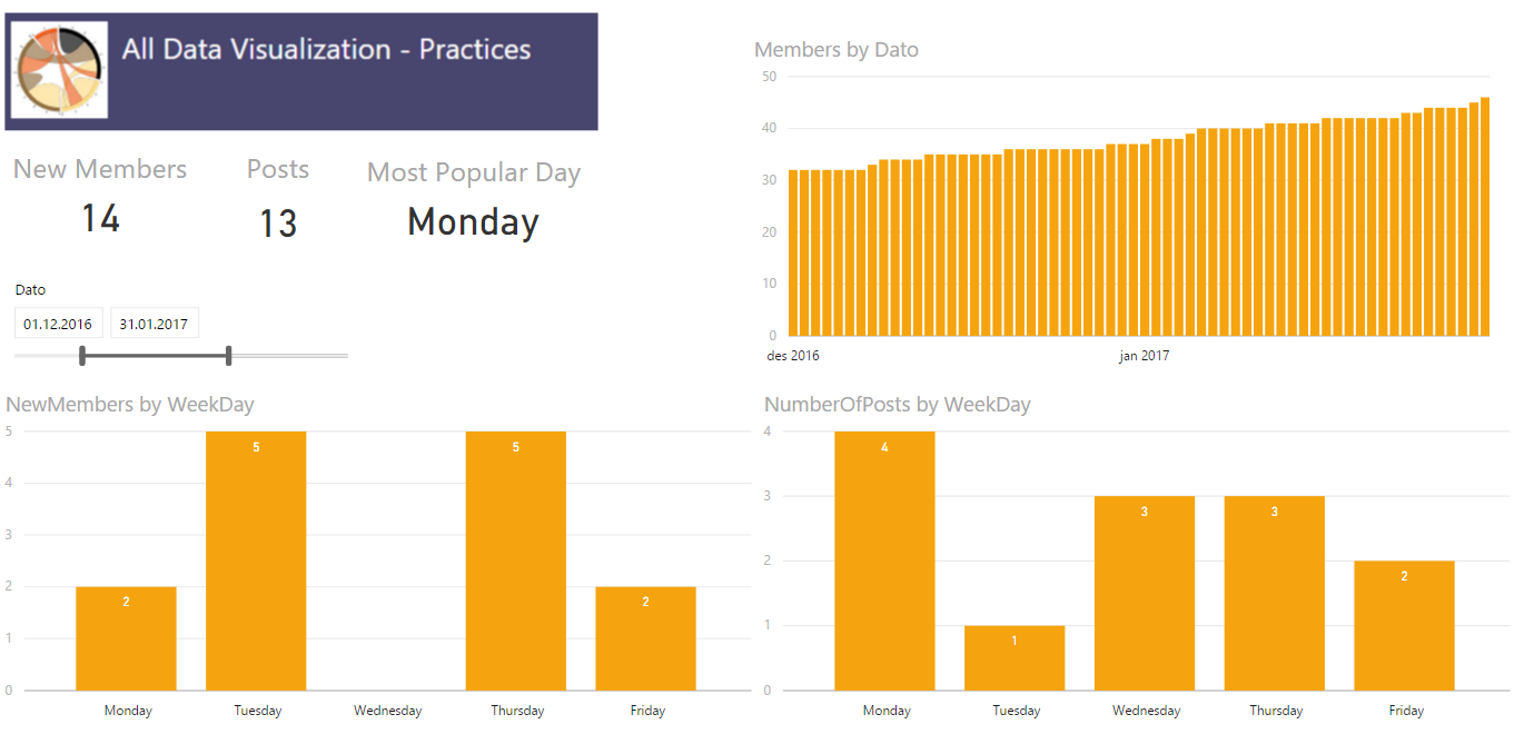
Continuing our journey on applying Andy Kirks tips and tricks from his series “The Little of Visualization Design” we are now at part 2, Clever Axis Scaling. As last time I suggest you read his post first so we already have some common ground.

Why use clever axis scaling

Clever axis scaling is a tool in order to create some drama in your visualization. It can also help you highlight values and draw your consumers eye towards it. Things that stand out will get attention, our brain is simple in this regard, and in this case that is what we are after.

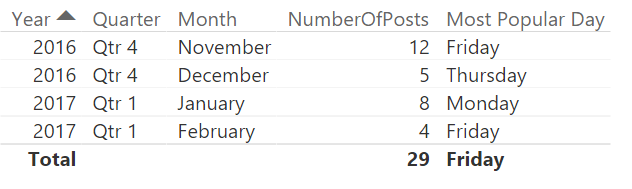
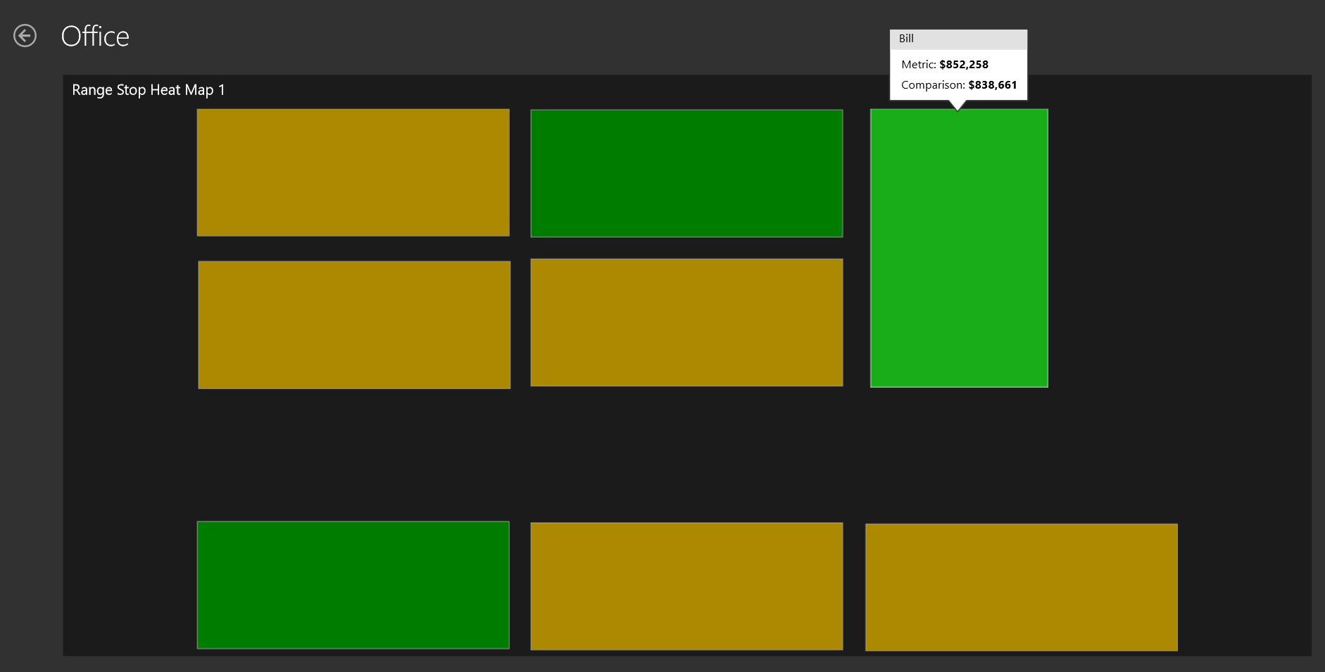
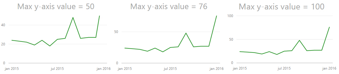
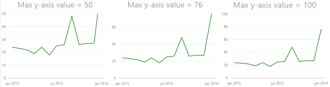
In the example the y-axis is set to 50, but the maximum value is 76. Now, my quick thought was “Great! this is easy, lets just set the y-axis to 50 so the helper line is 50”. This is easy to do, however the chart actually gets cut at 50. So it ends up looking the image below, which is not what we want at all. We are now hiding the most interesting data!

Max y-axis value set to 50 truncates your graph

So I tried setting it to 100. Now, that works okay, but the highest line on the y-axis is now not 50 so the dramatic effect of 76 shooting way above the last helper line on the y-axis disappears even though we still see the biggest increase on the chart to the left. So what is the solution? You need to try out what works best with your data. In this case it seems to work fine to choose 76, the maximum value in the chart. Now this will not always be the case because we can not control how many lines on the y-axis we get. If I make the chart higher you can see that the y-axis changes with numbers as well.

Trying out different max values on the Y-axis
Different heights can remove some of the effect we are after

Use it carefully

This solution also has the drawback that you are hardcoding the minimum and maximum value. So if you suddenly have a value higher than 76 you will loose it! In the end it comes down to what you want to tell with your chart, if your chart is going to change values often and how dramatic you want it. If you have no idea how your numbers will behave in the future I will not advice you to hard code min/max values unless you need it for a specific occation like a presentation. When you are done with that spesific occasion I suggest you turn them back to automatic to minimize confusion.

Final result

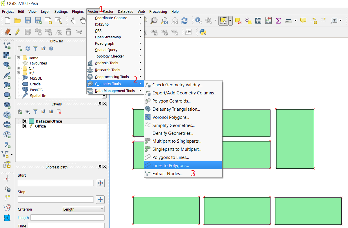
As with all tools PowerBI has some limitations compared to custom code and for example using something like D3.js where you can do absolutely everything you want! Having these limitation can make it a challenge to use all these tips and tricks  going forward, but we will do the best we can! In this case we might have some problems trying to create a more dramatic effect in our storytelling. Both with your axis’ as we have seen here, but also with data labeling as PowerBI does not let you choose which data points to highlight. So if you try to label the highest value without hovering over it it is not possible. Or at least I didn’t manage to, but if you do please let me know how you did it.

Also, if anyone has a way of hiding the ESRI logo in Power BI Desktop please let me know. They are not pretty and are driving me crazy!

Can data be beautiful?

Isn’t the beauty of beauty that we all find different things beautiful?

The other day Stephen Few posted a blog post named “Data Is Not Beautiful”. I have strong reasons to believe this was written because we at /r/dataisbeautiful contacted him and wondered if he was interested in doing an AMA, Ask Me Anything, where our users could ask question and he could provide his point of view and thoughts about data visualizations. Now, I have great respect for Stephen Few and I often send people interested in data visualization his way to read his material because he is so black and white and therefore it is easy to grasp what he think good data visualization is. In this blog post however, I think he misses the mark.

My beautiful might not be your beautiful

I have never been a fan of discussions regarding what is beautiful. What is beautiful is completely up to the consumer of some material, which can be music, art, nature or even data. Everyone has different taste and I never feel like these kind of discussion solves anything or contributes to making a disucssion go forward in any sort. The goal often seems to simply try and put themselves above others by claiming that they are not entitled to call anything beautiful. However, isn’t the beauty of beauty that we all find different things beautiful?

Data can indeed be beautiful

There are many things that can be beautiful about data and even though I am understanding Few’s point that this means that it is the attributes about data that is beautiful and not the data itself I find that to be a weird formulation. What about music is beautiful? It’s the combination of attributes, the compositon, volume, chords, etc. All of which is attributes of a music piece, which indeed can be beautiful.

Attributes of data can be things like structure, format, how it is organized and beyond that we can find a story to be beautiful. However, even without the story the data itself can be in what I’d call a beautiful state. It is not often I go to a customer and find beautiful data, but when I do it is a beauitufl sight indeed! Data that is well organized, formated and of good quality. I have no problem of using the word beautiful to describe this phenomenon.

I believe that data can indeed be beautiful, but in the end even if the data is beautiful it has little to no value if all it does is lie hidden within a database or an Excel sheet. Therefore it is our job to take that data and turn it into something useful for example through good visualizations. And when it comes to this I believe this older blog post from Few, “Should Data Visualizations Be Beautiful” is a lot more interesting than his recent post.

On a last note: As the moderator that reached out to Stephen Few and asked if he was interested in doing and AMA I still think it is a shame he declined. I personally find his point of view very interesting and I am sure a lot of users on /r/dataisbeautiful would have thought so too. There is something refreshing about a person speaking so loud about what he believe is right so if he at any time changes his mind we would be very happy to have him do an AMA at /r/dataisbeautiful.


“The Little of Visualization design” – with Power BI

Andy Kirk has an excellent series called “The Little of Visualization Design” where he gives small tips and tricks that can improve your data visualizations. If you have not seen it I strongly recommend it. Now, what I am going to try and do every week after summer vacation is to try and show you have you can take these tricks and use them with Power BI. But let’s kick start it now with part 1, dual labeling. I  suggest that you read the original post by Andy first so we are at a common ground about what we are going to look at which is this pie chart.

Dual labeling. It is suprisingly normal to see and it generates more cluster on your data visualisation than you need. Repeating something will not make things clearer, it will just create more ink on your graph and make it harder to focus on what’s important.

Now if you punch in the data and create a pie chart in Power BI we get what is shown below.

So Power BI does not provide you with a dual labeling issue at front, but it is quite easy to reproduce it with Power BI. In the “Format” pane you have a bunch of options which usually are great, but you have to use it with care and have a clear vision of why you are changing the original chart if not you can end up with all of these different variations.

The one in the bottom left is probably the closest to the one in the original post. It has dual labeling, and it has quite similar colors on the pie slices. Andy Kirk’s proposed solution is to remove the labeling and provide it directly onto the pie since the colors in the original graph is so similar. Now, that doesn’t  sound to far away from the default graph that Power BI provides us with. However the default is not perfect and here is what I would do in order to improve it:

  1. In Label Style choose “Category, data value”. This makes us see the actual number.
  2. Increase font size of detail label.
  3. Increase font size of the title. In general I think all default font sizes in Power BI are too small. I always feel like I need stronger contact lenses when creating a chart…
  4. Sort the chart by value so the slices appear in order of size.
    Note: I had originally made the font size of the detail label a bit bigger. However, this made the detail label for Canada disappear. Probably because it would take up the same space as Israel. So I wish they could make the position of the label a bit more dynamic.

In the end we end up with the chart below. So all in all the default chart Power BI created wasn’t too bad, but it could be improved. And make sure you are aware that not all options in the format pane in Power BI makes your data visualisation better, it could make it worse!

I’m looking forward to some weeks of summer and then I’ll continue this series when I am back! Thanks for reading. If you have any questions or feedback drop me a comment, it is greatly appreciated.

Learning by Sharing

I am currently in the process of re-learning D3.js, a javascript library used for data visualisation. That means I am always looking interesting datasets or existing visualisations I can remake. Over at reddit.com/r/dataisbeautiful some time ago one of the busiest pie charts I have ever seen was posted. It was showing how many players was playing at certain maps in the game Team Fortress 2. Unfortunately there where over 14 000 slices in this pie chart and it just didn’t make much sense.

                                                        Worldst busiest pie chart

I used about 5 minutes in Power BI to create a remake that was a bar chart in order to show why that is a better graph choice to show ratio between different categories. However, as some other users commented that removed some of the complexity which also is quite interesting. The fact that more than 14 000 maps are being played at in a month in a game that is ten years old is quite impressive.

                                                5 minute remake to show ratios better

So I ended up starting to think about a remake and asked the user who posted the pie chart if he had the dataset he had used. The internet is full of awesome people and in about one hour I had a csv files with 14 000 datapoints.

I have always gone code first, but I thought this time I would at least try to sketch some ideas on paper. I’m not the greatest at drawing, but that is also not the point. So I made this sketch. Initially I wanted to be able to create an overview which then could be broken down by some interaction. Unfortunately I did not have both the datasets I wanted at the time I built the visualisation, but I do now so maybe I have to revist this some time.

With that design in mind I built the visualisation. I’m not going to go into detail about how I did that here. You can see my cource code here if you want to have a look. The original is interactive so you can hover over a bubble to see more information.

                                           Finished visualisation

Context, context, context

Now, even though I made an interactive version I ended up deciding to post a static image of the chart. That was a mistake. The original pie chart had created quite a bit of discussion at /r/dataisbeautiful so my head took it for granted that everyone knew what this represented. They did not. Internet is big, and not everyone lives in one subreddit. So many users did not get the background or the context, and even though I had written that in a comment, comments are not read by a lot of Reddit’s users. The chart had no context and as of today the comment with the highest rating still reads: “Looks nice but no fucking idea what anything is representing”.

However, a lot of people did actually get what I was trying to show. How complex and how distrubuted the player base in Team Fortess is. I have gone through the thread and followed up question and such and as long as you can filter out the trolls and take things as constructive feedback you can get some really nice feedback. Where else would you get feedback from many, many thousands of people on your work?

  1. Context is hard on Reddit as a platform. You basically only have the title to explain as many users won’t read anything else, only look at the image.
  2. I should have posted the interactive version. It provides some more detail that people where missing. I also, for some reason, had removed the text stating “hover over a bubble for more information” in the static image. Including that text might have made more people go to the interactive version.
  3. Check more colorblind simulators. I used some simulators, but I think I forgot it with the last version. THere will be colorblind people when you share it with a userbase this big. If you need to test yours you can try this one.
  4. People in general have a lower threshold for saying negative things so you need to be able to filter comments quite hard and which you decide to listen to.
  5. It is written bubble, while boubble, as I had written all over the comments, is a river in France!

All in all, sharing your work is a really good exercise. Working on a project it is easy to go blind, but the internet won’t let you go easy if they see something to pick on.

If you create something you are proud of make sure to post it to /r/dataisbeautiful over at Reddit. We are always looking for original content!

                                    Gif of some steps of development

Creating a dynamic card with text value in Power BI

Alternative title: Finding string value from a dimension with highest numeric value

The company i work for uses Yammer and I have founded a Data Visualization group which I am, manually, keeping some statistics about using Power BI. The other day I found myself wanting a dynamic card in Power BI in order to highlight which day was the most active when it came to amount of posts. In order to do this I had to figure out how to make a measure returning not the max value, but the day which had the maximum amount of posts. My usecase is finding a weekday, but maybe you want to see which product is the most popular, which county has the most purchases or which salesperson has the most sales. All these cases should be able to reuse this measure.


First try

My inital thought was to create a table in my calculation and then slice it to return only one row and one column leaving me with one cell which had the day with the most number of posts. I made a measure which used a TOPN returning the row with most posts followed by a SELECTCOLUMN to select only the column which had the weekday in it. Now, this turned out to return me the overall correct day, but it did not work when I added a filter and the POwer BI visualization returned errors so I had to start over.


The solution

I have created three measures to solve this.

1) One simple sum of [Number of Posts]:


Number of Posts = SUM(Sheet1[NumberOfPosts])

2) Finding the day with the most posts by using MAXX


MaxPostsPerWeekDay = MAXX(VALUES(Sheet1[WeekDay]);[Number of Posts])

3) Using FIRSTNONBLANK on my WeekDay column and then return the value where the sum equals the maximum value. So in the end my measure looks like this.

Most Popular Day = 
IF(
    ISBLANK([Number of Posts]);
    BLANK();
    FIRSTNONBLANK(
        Sheet1[WeekDay];
        IF(
            [Number of Posts] =
            CALCULATE(
                [MaxPostsPerWeekDay];
                VALUES(Sheet1[WeekDay])
            );
            1;
            BLANK()
        )
    )
)

The first IF is to remove days that has no posts, in my case there is not much activity in the weekends so they will get filtered out. The beauty of this measure is that it is not limited to crads, but also easy to use with your filters and in tables where you would want it.

One way of auto refreshing Datazen in your browser

Yesterday I saw Christopher Finlan tweet about one way of making your Datazen dashboard auto refresh. He used a Firefox add-in for this, and I’d like to show you how I have been doing this.

If you want to show Datazen on a big screen there is at this point no out-of-the-box way to auto refresh your dashboard, meaning you have to open it to get new data. If you use the browser viewer you can quite quickly create one of the simplest websites in the world to do this.

In the header of your .html file add the following line:

<meta http-equiv="refresh" content="90" />

It will make your page refresh every 90 seconds. This can also be used if you want to circle some of your dashboards, sort of like a carousel. The line below will after 30 seconds go to the specified URL instead of just refreshing the page. To complete the circle make sure to go to the first dashboard in your last dashboard.

<meta http-equiv="refresh" content="30; URL='NextDashboard'">

So what does the .html file look like for the easiest example? Something like this, just exchange “DashboardURL” with your URL:

<!DOCTYPE html>
<html>
<head>
<title>Name of Dashboard</title>
<meta http-equiv="refresh" content="90 ">
</head>
<body style="margin:0px;padding:0px;overflow:hidden">
<iframe src="DashboardURL" frameborder="0" style="overflow:hidden;overflow-x:hidden;overflow-y:hidden;height:100%;width:100%;position:absolute;top:0px;left:0px;right:0px;bottom:0px" height="100%" width="100%"></iframe>
</body>

Note: If you are going to setup an auto refresh I’d suggest you also set up your guest account so you can have access to those dashboards without having to login. You can then use the public dashboard URL in the source of your iframe.

Creating a custom map for Datazen

Datazen lets you create and use custom maps which can be a really useful feature. What I am using for creating these maps is good, old Paint, internet and QGIS, which you can download here, http://www.qgis.org/en/site/forusers/download.html.

Say you want to create a map of your office. Maybe not the most useful map, but it is a small job to create an office layout in paint so lets start there. You can use other images as your starting point, but I want to make the entire thing from scratch to show that it is possible. My office will look like the one below with eight tables that I am going to map to different persons so we can see who actually does some work around the office! (None, of the names or data is real just to be sure)

Office

Next we need to convert this .png file to a vector file. I’m using http://www.autotracer.org/ for this, but there are other methods of doing it, software, other websites etc. Upload your file and make sure to choose DXF format on your output file.

convert

Now that we have a vector file of our office lets open up QGIS and just drag the .dxf file into it. Choose the default coordinate system and the layer with geometry type “linestring”. You should now have something like this in Qgis.

qgisOutline

Right click your layer, choose “save as…” and choose ESRI shapefile in the popup. When this is done you can right click your “linestring” layer and remove it. We are now going to edit the shapefile a little to make it simpler and also give the different shapes the name of people in our office so we can map data to their names. Right click the layer and press toggle editing. You are now able to edit, merge or delete sections. We can see that our vector image has some double lines around each desk, probably because we used to thick of a brush in paint so lets remove them.

toggelEditing

Find the “Select Feature” on your toolbar and select a section of your layer. This section becomes yellow and you can delete it. After deleting some of the sections I end up with a simple layer with eight squares, my office desks.

SelectFeature

We need to give the shapes some more friendly names. Right click your layer and select “Open attribute table”. You get a popup and in my case I see that all my shapes has the name C7 in the layer column. I’m going to select a row in this attribute table, and see that by doing this the related section in my layer behind turns yellow. I now know which section I am editing and I’ll say that Joe works by this desk. Then I do the same for the rest of the sections.

Attribute

Save your layer after giving all rows a name. One more step and it is ready to be imported into Datazen. If you try to import it at this stage your data will only end up on the lines of the desk and it is REALLY hard to see what color it has. Press Vector -> Geometry tools -> Lines to polygon to make your lines into polygons, an area. You will need to create a new output shapefile and save that.

Area

Alright, time to open up Datazen. Drag a map of your choice onto the Layout View, select “custom map from file” and find your shapefile. You will need the .shp and the .dbf file. Note: You can not have the shapefile open in QGIS at this point. It’s like reading from an Excel file, you can’t have it open when adding it to Datazen.

Press preview, and voila! You have created a map and inserted it into Datazen. Have fun, now the only limit is your mind or your customers need!

OfficeDatazen

Datazen: Brand package error

EDIT: If you want to get a brand package template you can find one here.

Do not copy/paste filenames for a brand package directly from the Datazen “End User Documentation”! Some of the dashes are em dashes and is not recognized by the server when you try to upload the .zip file with all the images. It will result in the following error message. You can see that the character in red circle which looked like a dash is now read as a û.

InvalidCharacter

Now, this wouldn’t be too bad if it wasn’t for the fact that I am now unable to delete this brand package as shown below. I uploaded this package to the server and I can upload another brand package to my individual HUBs, but for now I have yet to be able to delete the faulty brand package. I’m guessing I need to be able to access the RavenDB and delete it from there, but since this is a test server without a lot of dashboards I think I’ll just reinstall the server and start from scratch again.

deleteError

Part 2: Real time dashboard using a Raspberry PI and Power BI

Part 2: Using the Power BI API to make a real time dashboard

So you have set up your Azure Active Directory and created a Power BI provision for your organization? If not, you can have a look at part one of this series.

Before we start playing with the Raspberry PI let’s create a simple console application to see that we have set up things correctly in Azure Active Directory in the last post and are able to have real time updates on a dashboard in Power BI. Nothing advanced, but it is a nice test to see if we have set everything up correctly with our Azure account and Power BI. What we will do is create a dataset if it does not already exist in Power BI and insert rows of data into that dataset which will then update the dashboard in real time.

Creating a Power BI application

If you want to take the easy way out to see if you have set up everything correctly you can download a test code made by the MSDN team on github here: https://github.com/PowerBI/getting-started-for-dotnet. After downloading this code you need to insert your own Client ID that you get from your application page in Azure. You also need to set the redirect URI to the same as your application, if you don’t do this you will get an error message like the one below.

BadRequest

When you run the code you will see a green star-thingy appear to the right of your newly created dataset. After the dataset is created you can go and explore that dataset, even if it’s empty, and create a report. From the report you then pin report elements to a dashboard and when you run your application you will see the elements update real time. Nice!

NewDataset

I would suggest that you, either if you choose the easy way out or make a new application  from scratch, do some playing around and create your own dataset and insert some rows into it so you get a better understanding on what is happening and how the Power BI API works. Getting a good understanding of how datasets and inserting rows work will be useful later. We will not be able to reuse the dataset in the example code when using our Raspberry PI so we need to be able to create our own datasets, turn them into JSON and then insert some data. What you create is completely up to you and your imagination. I made a new application from scratch with a simple timer that  every second writes how many seconds it has been running, along with a timestamp, to Power BI. Does it provide great insight? Do I change how we look at this world? No, but it has provided me with some valuable hands on experience with the Power BI API. Other examples I’ve seen people doing is for example looking at clicks on a website and what device the clicks come from. Again it is completely up to you what you want to do.

Next up we will start to play with the Raspberry PI and then connect it to Power BI.

Dashboard

NOTE: When writing to a Power BI dataset there is, at the point when this post was written, no option to export a dataset from the Power BI Preview. This means that if you want to be able to use the data in another format than Power BI you need to store it another place as well. I am going to create an Azure SQL Database to store my data when using the Raspberry PI in case I want to use it other places other than PowerBI. Maybe you should consider doing the same?

Other parts of the series can be found here:

Part 1: Real time dashboard using a Raspberry PI and Power BI

Why I really like Datazen as a visualization tool

I was really excited when I saw that Microsoft had bought Datazen. I have been able to use Datazen for a while already, and I really like the product. At the Gurus of Business Intelligence conference in Oslo in 2014 I was lucky enough to be able to have a session together with Marc Reguera, @marcreguera, where I spoke about mobile and touch based reporting using Datazen as the example app.

Now why do I like Datazen? First of all I think they have a clear vision, a vision I like. They want to create great data visualizations for mobile and touch based devices which are easily designed and shared with others. It is not a data discovery tool like Qlik or Tableau so you need to have your data organized in order to get the full effect. But when you are ready to create visualizations and share those with your coworkers it is really good in my opinion. You have predefined graphical elements you drag and drop onto your design surface and connect your data to. You also have the possibility to create custom maps and color palettes with backgrounds to get the right feel for your dashboards.

Datazen has three major components. You need a Datazen server in order to get data from other sources than local Excel files. When you have created a dashboard you are also able to deploy your dashboard to the Datazen server so it can be consumed by others. The server also grants you access to a control panel where you can setup KPIs, set permissions, set up connections to your data sources and create data views which can then be imported into your dashboards.

This brings us to the other two parts of the Datazen stack, the viewer and publisher apps. The publisher app is only available on Windows 8 devices at this point. This is where you import your data and create your dashboards before you can publish them to the server. The publisher itself is also made for touch so using f.ex a Surface to create visualizations on the go, or in a demo environment, is a real joy! It is quite fast to setup a dashboard design and connect your data to the graphical elements you have available. In my eyes this is a really important feature because it allows you to quickly iterate over different designs. I don’t know how many times a client has come back and said “But that’s not how I visualized the report in my head”. Now you can sit with your client and quickly make a new version of the same dashboard right there and then. I have several times prepared a dashboard to present in a demo, but have found myself creating a dashboard on the go instead. Because it is easy to do so. Because I can. You can even hand over your computer to the client and let them create the dashboard during your demo!

The viewer app lets you consume dashboards deployed to a Datazen server you have access and is available for all mobile platforms as a native app. If you are used to Android you will still have the Android feel unlike some apps that have been made to fit all platforms, but rarely do. When you design a dashboard you create several versions of the same dashboard to fit different resolutions. A dashboard made for a phone may have to emphasize different things than one made for a laptop, simply because some graphical elements, like a map, is perhaps not that suited for a small screen. Datazen also gives you offline access to your dashboard which I think is absolutely essential for all apps.

You can download the Datazen publisher for free from the Windows 8 store and use local Excel files to create your own stunning dashboards right away. If you want to share those dashboards or get data from your databases or other sources, you will need access to a Datazen server. When the announcement was made Microsoft also announced that SQL Server Enterprise Edition customers with version 2008 or later and Software Assurance are entitled to download the Datazen Server software at no additional cost. Give it a go. It is a really well made product, and a lot of fun to play with! The road from raw data to presenting them on a well made dashboard on someone else’s mobile phone is getting shorter!

For more information go to http://www.datazen.com/.

Example of a dashboard made with Datazen