Andy Kirk has an excellent series called “The Little of Visualization Design” where he gives small tips and tricks that can improve your data visualizations. If you have not seen it I strongly recommend it. Now, what I am going to try and do every week after summer vacation is to try and show you have you can take these tricks and use them with Power BI. But let’s kick start it now with part 1, dual labeling. I suggest that you read the original post by Andy first so we are at a common ground about what we are going to look at which is this pie chart.
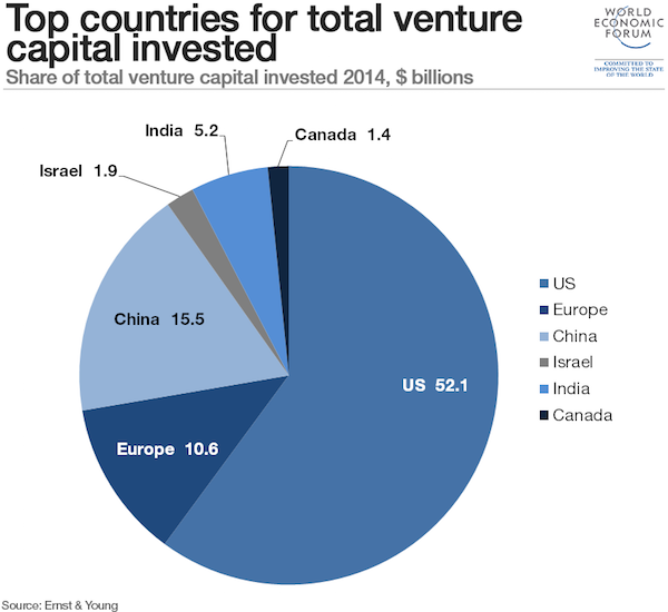
Dual labeling. It is suprisingly normal to see and it generates more cluster on your data visualisation than you need. Repeating something will not make things clearer, it will just create more ink on your graph and make it harder to focus on what’s important.
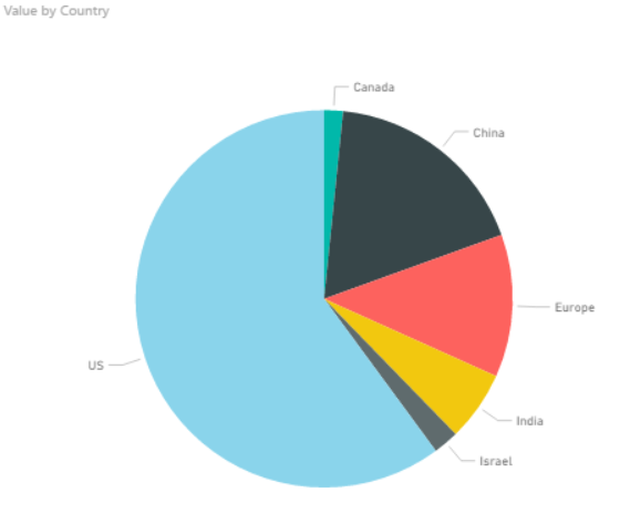
Now if you punch in the data and create a pie chart in Power BI we get what is shown below.
So Power BI does not provide you with a dual labeling issue at front, but it is quite easy to reproduce it with Power BI. In the “Format” pane you have a bunch of options which usually are great, but you have to use it with care and have a clear vision of why you are changing the original chart if not you can end up with all of these different variations.
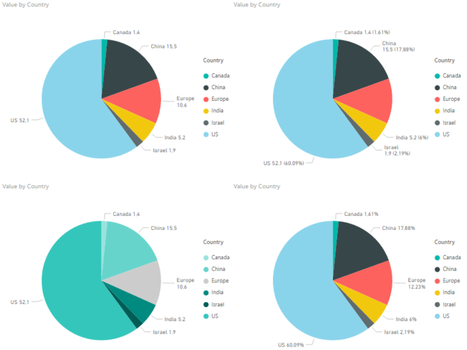
The one in the bottom left is probably the closest to the one in the original post. It has dual labeling, and it has quite similar colors on the pie slices. Andy Kirk’s proposed solution is to remove the labeling and provide it directly onto the pie since the colors in the original graph is so similar. Now, that doesn’t sound to far away from the default graph that Power BI provides us with. However the default is not perfect and here is what I would do in order to improve it:
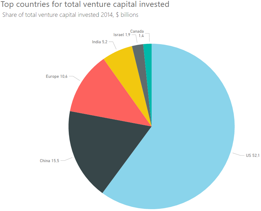
- In Label Style choose “Category, data value”. This makes us see the actual number.
- Increase font size of detail label.
- Increase font size of the title. In general I think all default font sizes in Power BI are too small. I always feel like I need stronger contact lenses when creating a chart…
- Sort the chart by value so the slices appear in order of size.
Note: I had originally made the font size of the detail label a bit bigger. However, this made the detail label for Canada disappear. Probably because it would take up the same space as Israel. So I wish they could make the position of the label a bit more dynamic.
In the end we end up with the chart below. So all in all the default chart Power BI created wasn’t too bad, but it could be improved. And make sure you are aware that not all options in the format pane in Power BI makes your data visualisation better, it could make it worse!
I’m looking forward to some weeks of summer and then I’ll continue this series when I am back! Thanks for reading. If you have any questions or feedback drop me a comment, it is greatly appreciated.