Ever used shapes or images in Power BI and wanted a more flexible way of moving things forward and backwards on your canvas? Yeah, me to!
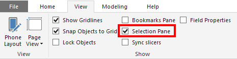
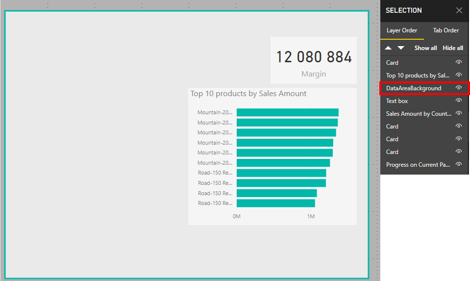
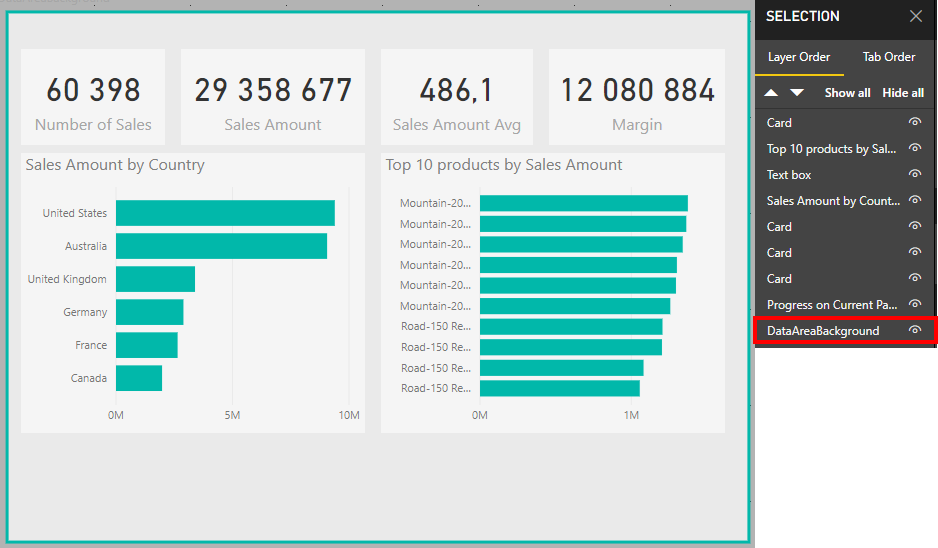
Under “View” there is a pane called “Selection Pane” and when checked you will see all the different elements on our page, and you can arrange them as you like where the ones on top of the list will be in the front of the elements below on your page. So if you use a shape for a background as me below, just pull it all the way to the bottom, and hepp! It is correctly placed as a background, and not covering the important stuff.
Activate the “Selection Pane” to reorder visualsBefore: My shape is in front of a lot of my graphsAfter: My shape is correctly move to the background
A very normal calculation we do is to compare a value, for example sales, against how we did last year. The easiest way to do this is by using the SAMEPERIODLASTYEAR function to create a measure that look like this
As shown in the image above this works fine for a given date, but what if we want to look at how one week compared to last year? For retailers this is a very normal demand. ow can we compare monday in one week to monday in the same week last year? After all it is a big difference in how much sales is being done on a Saturday compared to a Sunday, the shop might even be closed on sunday. For this we need to create a calculated column to help us out. We are going to call it DWY (for DayWeekYear) and we can do it like this
DWY = WEEKDAY(DimDate[Date])*1000000
+ WEEKNUM(DimDate[Date])*10000
+ YEAR(DimDate[Date])
Note: For people not using American calender you may need to prep week number otherwise to get ISO week, for example in your date dimension. Then you can do the calculation. The important part is that is lines up with your definition of day in week, week number and year.
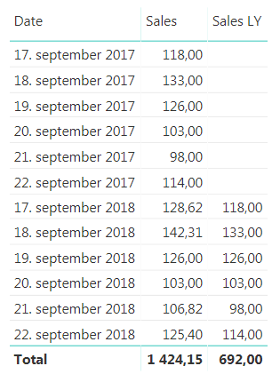
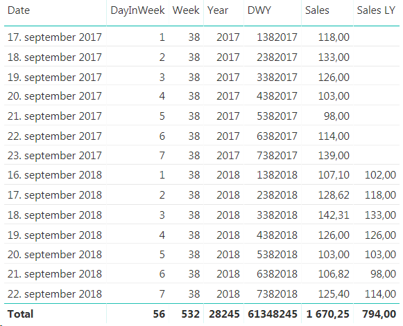
Sales for given dates with the new DWY column
Here you can see that 17th of September 2017 is a Monday, but in 2018 it is a Tuesday so we are unable to compare the two. Now, the beauty here with our new DWY column is that if we subtract one from a DWY date this year we get the same day in the same week last year. So, DWY Last Year = DWY -1. Which is great! So we can use this to create a measure that compares day in week vs the same day in week last year.
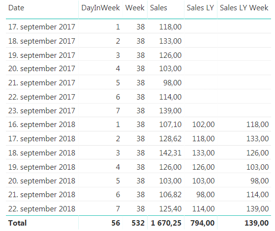
This works great when we look at a specific date, but you will see that the total row for the new measure is the same as the last value, and not the sum, so we have to extend it a little bit to make it sum up all the days we are showing. To do this we will use the SUMX function to create this measure
Finished measure to compare day in week vs last years day in week
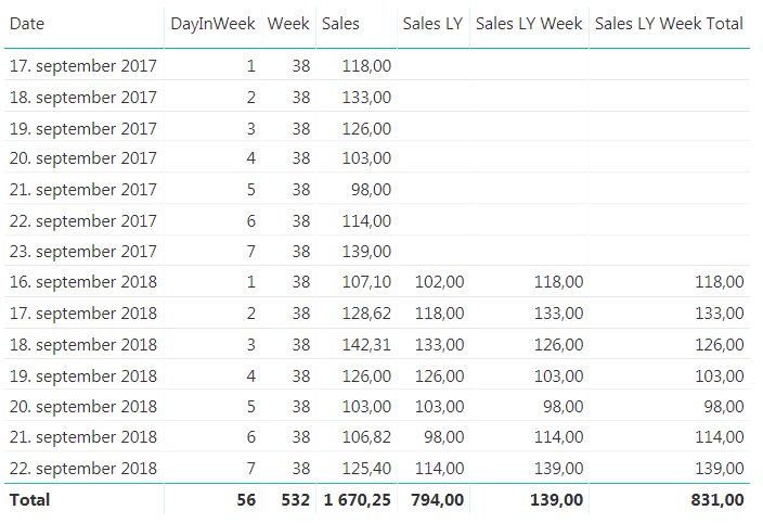
There you have it. But can we do more? In general I don’t like having more than one measure saying the same thing. We are looking at sales for last year in both measures we have created, it is just that one is comparing with a specific date and one is comparing with day in week. I would like to just have one measure that is Sales Last Year and then we can say that if the user is filtering on a week or a weekday we will show them the day in week last year value and otherwise we will show them the specific date. Now, this might be on a case to case scenario, but if you keep both measures available to they users they will have to remember that they cannot use the Sales LY Week Total measure if they want to look at a specific date, they have to use the “normal” Sales LY measure. In my experience this is often a source for user errors that might be confusing so we can hide this complexity by combining the measure we have created.
Sales LY Total =
IF
(
 ISFILTERED(DimDate[Week]) || ISFILTERED(DimDate[DayInWeek])
 ;FactSales[Sales LY Week Total]
 ;FactSales[Sales LY]
)
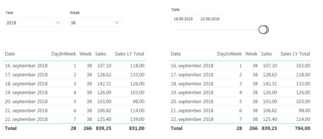
The finished result will behave as shown below. The same measure is used in both tables, but the one on the left is filtered on week while the one on the right is filtered by dates. If you have more ways of showing week or week day in your date dimension, like the week day name remember to include them in the IF statement to make them work as we want them to.
In a project we are using Talend to load a lot of data each night and we are experiencing randomly getting “Connection does not exists” error messages during our data load. This can happen at any time both during the connection phase, and so far we have been unable to see any real signs of why it is happening and when. In addition this leads connection reset often leads to our data being corrupt and unusable meaning we have to start all over. We have therefore set up an error handling when reading from this data source.
Setting up a try/catch in Talend
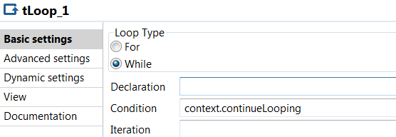
Create a context variable that we call continueLooping. This boolean will be used to end our loop when we reach our maximum number of attempts or the connection has been successful
Add a tJava where you initialize the variable to true
Then add a tLoop as a While and condition context.continueLooping
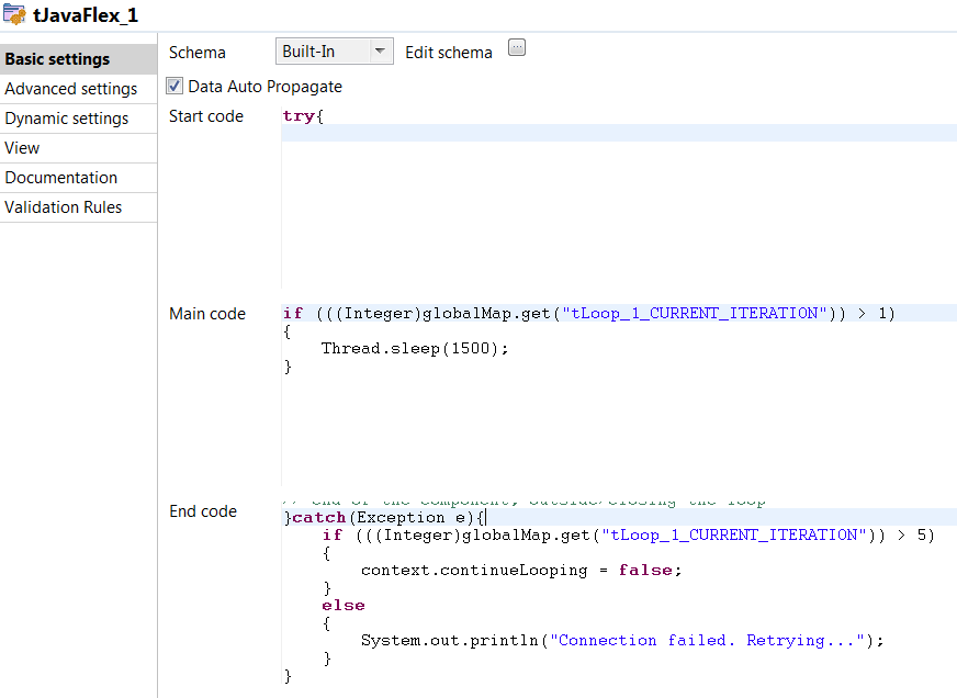
Now we add a tJavaflex where our try/catch block will be. Put the try block in the start code and the catch block in the end code. Mine look something like this. Feel free to add some logging in here as well so you can keep track of where the error is happening. in the main code I make the job sleep for a little while in order to give our connection some time to get back up.
Add a tJava with a “On component Ok” trigger on your database connection. Here set the continueLooping to false to stop the loop.
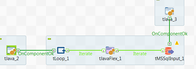
In the end it should look something like this:
Extending the error handling
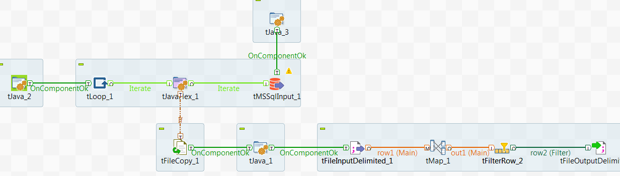
In our case we are already looping our read by using a job above this one to read data one month at a time. The output of this job is large .csv files which we then upload to Azure blob storage in order to use Polybase to finally move the data into our SQL DWH data warehouse. Since we know we can loose connection in the middle of our read we need to clean up our .csv files before starting the loop all over for the month that we are reading. This is done by adding an If trigger on the tJavaflex where our trigger is to check which iteration we are in. If we are not in the first iteration of our loop something has gone wrong and we need to do some cleanup to make sure our data is correct in the end. We therefore remove all rows for the month we are supposed to read before we let the loop start over. Now, the only way I have been able to do this is by creating a copy of our existing file, filter out rows for current month and then write it back as the original file. In the end it looks like this:
Overall it seems to work very nicely when we are unable to trust that our data source will keep our connection open for the whole duration.
Continuing our journey on applying Andy Kirks tips and tricks from his series “The Little of Visualization Design” we are now at part 2, Clever Axis Scaling. As last time I suggest you read his post first so we already have some common ground.
Why use clever axis scaling
Clever axis scaling is a tool in order to create some drama in your visualization. It can also help you highlight values and draw your consumers eye towards it. Things that stand out will get attention, our brain is simple in this regard, and in this case that is what we are after.
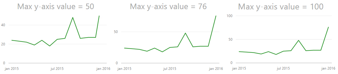
In the example the y-axis is set to 50, but the maximum value is 76. Now, my quick thought was “Great! this is easy, lets just set the y-axis to 50 so the helper line is 50”. This is easy to do, however the chart actually gets cut at 50. So it ends up looking the image below, which is not what we want at all. We are now hiding the most interesting data!
Max y-axis value set to 50 truncates your graph
So I tried setting it to 100. Now, that works okay, but the highest line on the y-axis is now not 50 so the dramatic effect of 76 shooting way above the last helper line on the y-axis disappears even though we still see the biggest increase on the chart to the left. So what is the solution? You need to try out what works best with your data. In this case it seems to work fine to choose 76, the maximum value in the chart. Now this will not always be the case because we can not control how many lines on the y-axis we get. If I make the chart higher you can see that the y-axis changes with numbers as well.
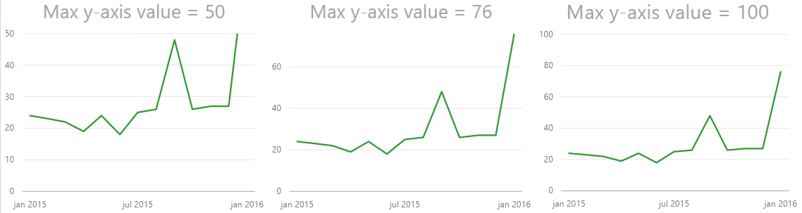
Trying out different max values on the Y-axis
Different heights can remove some of the effect we are after
Use it carefully
This solution also has the drawback that you are hardcoding the minimum and maximum value. So if you suddenly have a value higher than 76 you will loose it! In the end it comes down to what you want to tell with your chart, if your chart is going to change values often and how dramatic you want it. If you have no idea how your numbers will behave in the future I will not advice you to hard code min/max values unless you need it for a specific occation like a presentation. When you are done with that spesific occasion I suggest you turn them back to automatic to minimize confusion.
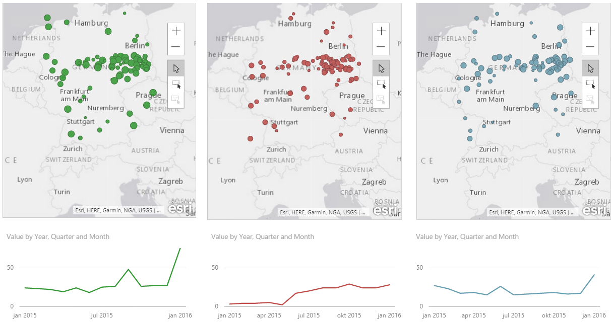
Final result
As with all tools PowerBI has some limitations compared to custom code and for example using something like D3.js where you can do absolutely everything you want! Having these limitation can make it a challenge to use all these tips and tricks going forward, but we will do the best we can! In this case we might have some problems trying to create a more dramatic effect in our storytelling. Both with your axis’ as we have seen here, but also with data labeling as PowerBI does not let you choose which data points to highlight. So if you try to label the highest value without hovering over it it is not possible. Or at least I didn’t manage to, but if you do please let me know how you did it.
Also, if anyone has a way of hiding the ESRI logo in Power BI Desktop please let me know. They are not pretty and are driving me crazy!
I got some great new during my vacation I got a mail saying I was selected to give a talk at SQLSaturday in Oslo this year. I also got notified by the tweet below which I had completely forgotten from last year. Nice surprise to see I have succesfully made a goal of mine, even though I had forgotten I had set it! I’ve been to every SQLSaturday that has been in Oslo and it has always been a great event so looking forward to be able to contribute with a talk myself this year!
My talk is titled “Data Visualization – More Than a Hygiene Factor”, based on a quote from this Medium Post. You can read my abstract below.
"For many companies data visualization is still a hygiene factor; necessary but not crucial"

In a world where everyone wants to use data to drive their business forward it is important to be able to communicate and speak the language of data even though data itself can be complex. One way of doing this is by making good data visualisations. Good data visualisations are engaging, they are informative and they let your data tell you its story. Too often data visualisation gets a low priority making the final result feeling lacklustered and making the users uninspired.

In this session we look at some data visualisation principles and best practices, in order to deliever your message with a clear point of view and minimize confusion. Lastly we will look at how you can use these practices with Power BI in order to improve how data can be communicated to your end users in the best possible way making them come back over and over.
SQLSaturday is a free 1-day training event for Microsoft Data Platform and SQL Server professionals, providing a variety of high-quality technical sessions. If you work on the Microsoft Data Platform SQLSaturday is a great way to get inspired and hear about new things. You can find more information about SQLSaturday, September 2nd in Oslo here!
Andy Kirk has an excellent series called “The Little of Visualization Design” where he gives small tips and tricks that can improve your data visualizations. If you have not seen it I strongly recommend it. Now, what I am going to try and do every week after summer vacation is to try and show you have you can take these tricks and use them with Power BI. But let’s kick start it now with part 1, dual labeling. I suggest that you read the original post by Andy first so we are at a common ground about what we are going to look at which is this pie chart.
Dual labeling. It is suprisingly normal to see and it generates more cluster on your data visualisation than you need. Repeating something will not make things clearer, it will just create more ink on your graph and make it harder to focus on what’s important.
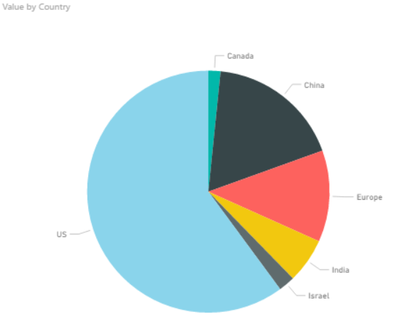
Now if you punch in the data and create a pie chart in Power BI we get what is shown below.
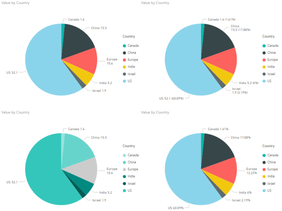
So Power BI does not provide you with a dual labeling issue at front, but it is quite easy to reproduce it with Power BI. In the “Format” pane you have a bunch of options which usually are great, but you have to use it with care and have a clear vision of why you are changing the original chart if not you can end up with all of these different variations.
The one in the bottom left is probably the closest to the one in the original post. It has dual labeling, and it has quite similar colors on the pie slices. Andy Kirk’s proposed solution is to remove the labeling and provide it directly onto the pie since the colors in the original graph is so similar. Now, that doesn’t sound to far away from the default graph that Power BI provides us with. However the default is not perfect and here is what I would do in order to improve it:
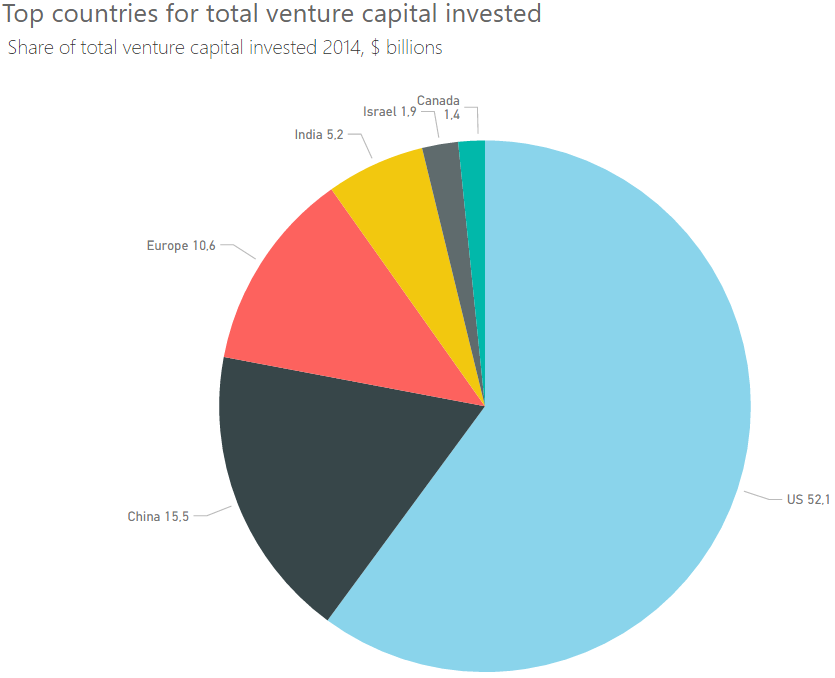
In Label Style choose “Category, data value”. This makes us see the actual number.
Increase font size of detail label.
Increase font size of the title. In general I think all default font sizes in Power BI are too small. I always feel like I need stronger contact lenses when creating a chart…
Sort the chart by value so the slices appear in order of size.
Note: I had originally made the font size of the detail label a bit bigger. However, this made the detail label for Canada disappear. Probably because it would take up the same space as Israel. So I wish they could make the position of the label a bit more dynamic.
In the end we end up with the chart below. So all in all the default chart Power BI created wasn’t too bad, but it could be improved. And make sure you are aware that not all options in the format pane in Power BI makes your data visualisation better, it could make it worse!
I’m looking forward to some weeks of summer and then I’ll continue this series when I am back! Thanks for reading. If you have any questions or feedback drop me a comment, it is greatly appreciated.
Alternative title: Finding string value from a dimension with highest numeric value
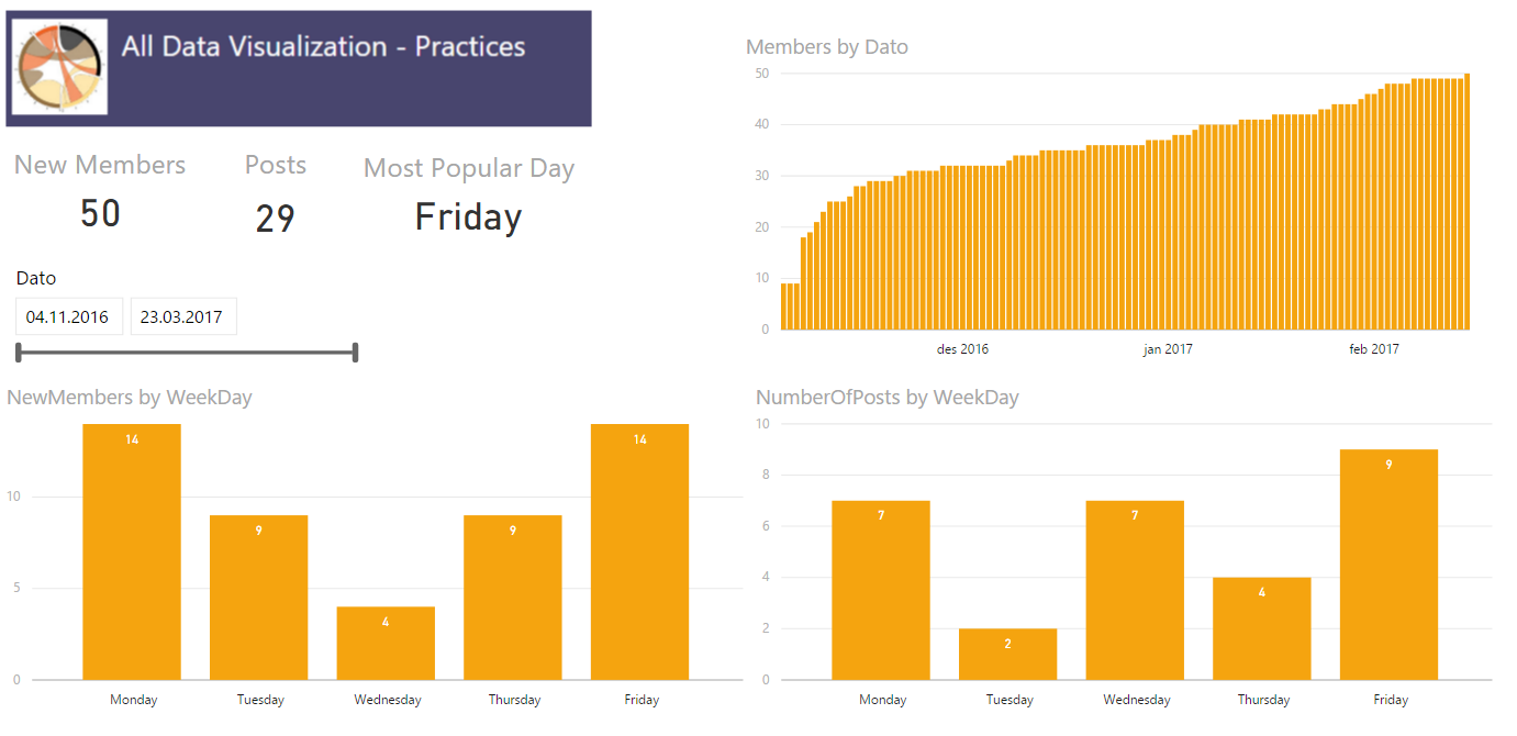
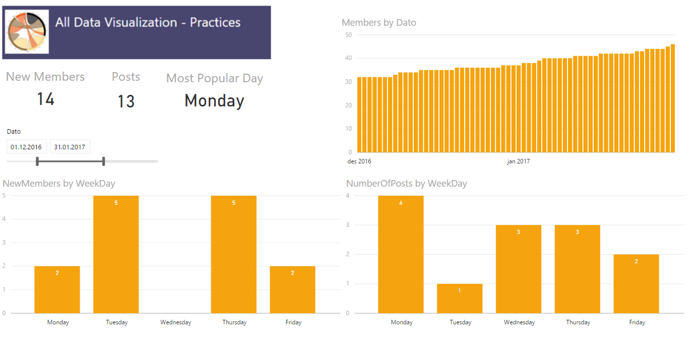
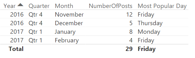
The company i work for uses Yammer and I have founded a Data Visualization group which I am, manually, keeping some statistics about using Power BI. The other day I found myself wanting a dynamic card in Power BI in order to highlight which day was the most active when it came to amount of posts. In order to do this I had to figure out how to make a measure returning not the max value, but the day which had the maximum amount of posts. My usecase is finding a weekday, but maybe you want to see which product is the most popular, which county has the most purchases or which salesperson has the most sales. All these cases should be able to reuse this measure.
First try
My inital thought was to create a table in my calculation and then slice it to return only one row and one column leaving me with one cell which had the day with the most number of posts. I made a measure which used a TOPN returning the row with most posts followed by a SELECTCOLUMN to select only the column which had the weekday in it. Now, this turned out to return me the overall correct day, but it did not work when I added a filter and the POwer BI visualization returned errors so I had to start over.
The solution
I have created three measures to solve this.
1) One simple sum of [Number of Posts]:
Number of Posts = SUM(Sheet1[NumberOfPosts])
2) Finding the day with the most posts by using MAXX
MaxPostsPerWeekDay = MAXX(VALUES(Sheet1[WeekDay]);[Number of Posts])
3) Using FIRSTNONBLANK on my WeekDay column and then return the value where the sum equals the maximum value. So in the end my measure looks like this.
Most Popular Day =
IF(
    ISBLANK([Number of Posts]);
    BLANK();
    FIRSTNONBLANK(
        Sheet1[WeekDay];
        IF(
            [Number of Posts] =
            CALCULATE(
                [MaxPostsPerWeekDay];
                VALUES(Sheet1[WeekDay])
            );
            1;
            BLANK()
        )
    )
)
The first IF is to remove days that has no posts, in my case there is not much activity in the weekends so they will get filtered out. The beauty of this measure is that it is not limited to crads, but also easy to use with your filters and in tables where you would want it.
2017 is here and once again I’ll have a goal of writing here at least one time every month. Last year I failed this goal, but this year? Let’s give it another go.
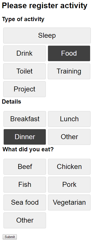
I have a list of projects I want to do and I’ve finally started to track what I am doing every day. I’ve thought of this for a while as I think it would be interesting to see if I am able to find out if there are parameters in my life that affect things like my mood and evergy level. To do this tracking I’ve made a very simple website that is hosted in Azure with an Azure SQL Database behind to store my data. This was needed to make the registration as easy as possible. I had an Excel sheet the first couple of days before I got this site up and running, and I would not recommand that approach at all if you’re going to do the same. It is a too big effort to open an excel sheet every time you drink something or whatever you want to register. So far I am very happy with how it is working out, but I have started to get quite the backlog of increasing size with ideas for improvements. I have told myself to not change anything during January and then do an evalutation of how I think it is working out and which changes are absolutely needed. I’ve also decided not too look at any of the data until January is over. I don’t want to be too aware of what I am logging in the beginning, but rather try to make logging into somethig I just do and then when I have some months of data I can see if something sticks out from them.
So far I have split registration into two parts. First part is activities during the day. Things such as what I eat, drink, if I work out and for how long etc. The other part is a registration I do at the end of each day. Here I note down my mood, energy level, stress level and overall feeling as well as some small notes about f.ex if I hang out with friends during the day or did 100 math puzzles on an app I downloaded. As mentioned I am hoping to see if there is something that affects f.ex my mood and I am able to more actively apporach these things in the future. Not really sure if this will pop up, but at least I’ll have some more data on myself and what I do during the day.
Ever done something like this or have ideas of things that are worth noting down during the day? Let me know. I know some people take these kind of things to the extreme and I probably won’t do that, but I’m always interested in new input or ideas.
Note at the end: I really like how easy it is to create a web app in Azure and everytime I now do a push to my master branch in my Git reposit the website updates within seconds. Easy to set up a Visual Studio Team Services account and create the reposit to start working right away.