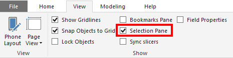
Ever used shapes or images in Power BI and wanted a more flexible way of moving things forward and backwards on your canvas? Yeah, me to!
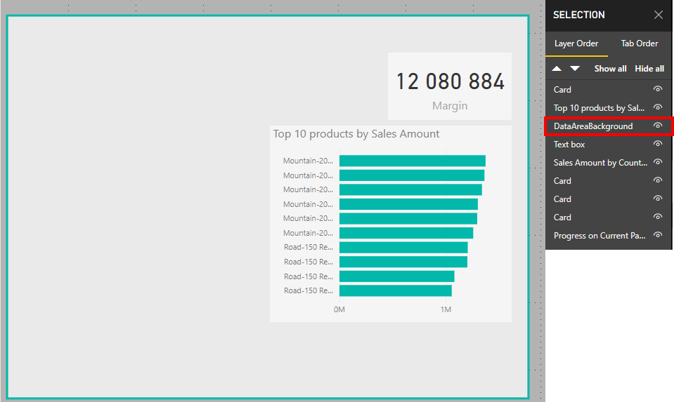
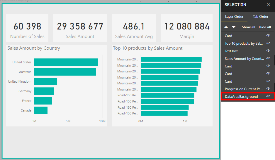
Under “View” there is a pane called “Selection Pane” and when checked you will see all the different elements on our page, and you can arrange them as you like where the ones on top of the list will be in the front of the elements below on your page. So if you use a shape for a background as me below, just pull it all the way to the bottom, and hepp! It is correctly placed as a background, and not covering the important stuff.
Activate the “Selection Pane” to reorder visualsBefore: My shape is in front of a lot of my graphsAfter: My shape is correctly move to the background
2018, another year where I got a new job, a year where my list of projects I’d like to do some time kept growing and a year where Twitter surprised me as a great discussion platform. To everyone I’ve talked to, everyone creating content I have seen, read or listened to and everyone that has read or heard anything I’ve done: Thank you for a great year!
Bought about 3000 googly eyes in 2018 as well! They look great everywhere!
New Job… Again…
When I graduated doing technical stuff was the best part of my job, digging into data and writing code and to this day I enjoy this a lot. However at some point I realized that what’s intriguing to me about the data and analytics domain is that it needs both the technical side, and the more human side where culture, change and organization comes in. Every job change I have done from my first one I have mentioned this, but when I started looking back earlier this year I realize that this has probably been taken as a positive trait in a developer, and not that I was interested in moving more towards the less technical side. I believe there is a huge advantage coming from the technical side, but I was never able to get a project where I could work a lot more on the non-technical side, and even though I have tried sometimes it comes down to the fact that a technical resource don’t always have the mandate to go as deep into the business side as I’d like. And in the end I found out it was time to move on, and search for something a bit different than what I have done so far.
After a lot of thinking and a lot of interviews I ended my career as a consultant and started in a new job on the 1st of October as Head of BI & Analytics in Sector Alarm Group. A position I can shape a bit like I want and since we are a small team, for now, I can still do technical stuff when needed or if I feel like my hands are getting to clean and needs some real data shuffling. So far it has been all about finding the baseline for where we are, and where we need to go, but I have high dreams of what we can to in 2019, and also as we move further into the future!
Talks and Presentations
I’ve always enjoyed doing talks and presentations about topics I am interested in. 2018 started out with a presentation for the Microsoft Data Platform User Group here in Oslo, and several other presentation has followed that both internally and externally. #SQLSatOslo is always a joy to attend and speak on, and I have never spoken as much about data visualization as I have done in 2018, both at projects with clients and internally in my previous employer. I still believe data visualization is one of the best ways of making data more human, and I will continue to spread the importance of it in my new job, and at external events where I can.
Working With Graduates
In 2018 I’ve been able to work quite a lot with graduates, and this is one thing I’m going to miss by not working as a consultant in a relatively big company. Seeing how hungry graduates are to learn and jump into new things is extremely inspiring. And even though I sometimes feel like I am doing absolutely nothing because they do incredible work I hope I have been able to provide them with a good understanding for data as a domain and a good foundation for their continued career. I hope the best for every graduate I have been able to work with this year!
Special Shoutout
As most people that know me know I love data visualization and Twitter is my go to source for this, #dataviz. Where I earlier only where looking for cool visualizations this year I have noticed something else about this community. They have some really high quality discussions on this forum where you can’t write more than 280 characters in one tweet! I am astound that some of the best discussions and feedback loops comes in this forum. Other forums, such as LinkedIn, to often becomes a place where everyone agrees on everything and it is all about trying to praise the poster and what they have done. The data visualization community can one day salute a great visualization, and the next day have an intense discussion where no one agrees, but are still responding in a way that shows resepct and it feels like they truly want to help out, and push both the poster and the data visualization field forward!
Hello 2019
The biggest thing I know for 2019 is that we are expecting a new child in the start of February, and it is going to be great! Although I wonder how much we can have forgotten over the past 3,5 years about babies. At work it is time to stop talking about what we should do and start doing some actual work and deliver new, user friendly, great data products and platforms while building a business culture that is thirsty for data, and where data is an asset that everyone knows the importance of and uses every day in their work. High dreams? Hello! But we will start small both on the technical side and the business side to make sure they both can feed the other side with what they need.
Other than that I have hopes of crossing out more of the projects in my list of projects that I never get to do, I really wish the day had 27 hours because cutting sleep isn’t really an option. I’d like to do more custom data visualization and perhaps even mix it with 3D printing. I hope to write a lot more, both technical stuff here, but also more in the form of fiction. I’d like to learn how to play the guitar better, I bought a harmonica at an auction which I’d like to use more and I got a jaw harp for christmas I have to larn to play. And to top of the music part I am still working on turning datasets into music, not by using machine learning, but more as an art project. And the list goes on most likely long into 2020.
2018 has been a great year when I look back and here’s for 2019 to be ever better! And I hope you will be able to cross of some things on your list of things you’d like to do as well!
A while back Stephen Few argued that data can not be described as being beautiful. At that point in time I did not agree to this statement. I do think data can be beautiful, but as the term “smart data” is popping up more and more I find myself unable to use this term to describe data. Am I being a hypocrite? Can data be beautiful, but not smart?
To me data is one of the dumbest things out there, it just exists. Data on it’s own creates absolutely nothing, it wouldn’t even have existed if someone didn’t create it. So even though I find myself saying that data can be beautiful I don’t like the term smart data. Data can be structured, organized and formatted beautifully, but being smart? No!
By stating that data is smart we take away the credit from many people who works with data each day. Smart people, really smart people! They are the ones that deserves the credit for all the amazing things data can be used for, not the data itself. Do we call trees smart just because we can do amazing things with them? No, but the inventors of paper, housing and so on they were geniuses!
Give credit where credit is due. Data is lazy, it would lie on the couch all day if it could. The people that works with data on the other hand and gets the data up from the couch and creates amazing products and services with it, they do all the dirty work and should also get all the glory!
Isn’t the beauty of beauty that we all find different things beautiful?
The other day Stephen Few posted a blog post named “Data Is Not Beautiful”. I have strong reasons to believe this was written because we at /r/dataisbeautiful contacted him and wondered if he was interested in doing an AMA, Ask Me Anything, where our users could ask question and he could provide his point of view and thoughts about data visualizations. Now, I have great respect for Stephen Few and I often send people interested in data visualization his way to read his material because he is so black and white and therefore it is easy to grasp what he think good data visualization is. In this blog post however, I think he misses the mark.
My beautiful might not be your beautiful
I have never been a fan of discussions regarding what is beautiful. What is beautiful is completely up to the consumer of some material, which can be music, art, nature or even data. Everyone has different taste and I never feel like these kind of discussion solves anything or contributes to making a disucssion go forward in any sort. The goal often seems to simply try and put themselves above others by claiming that they are not entitled to call anything beautiful. However, isn’t the beauty of beauty that we all find different things beautiful?
Data can indeed be beautiful
There are many things that can be beautiful about data and even though I am understanding Few’s point that this means that it is the attributes about data that is beautiful and not the data itself I find that to be a weird formulation. What about music is beautiful? It’s the combination of attributes, the compositon, volume, chords, etc. All of which is attributes of a music piece, which indeed can be beautiful.
Attributes of data can be things like structure, format, how it is organized and beyond that we can find a story to be beautiful. However, even without the story the data itself can be in what I’d call a beautiful state. It is not often I go to a customer and find beautiful data, but when I do it is a beauitufl sight indeed! Data that is well organized, formated and of good quality. I have no problem of using the word beautiful to describe this phenomenon.
I believe that data can indeed be beautiful, but in the end even if the data is beautiful it has little to no value if all it does is lie hidden within a database or an Excel sheet. Therefore it is our job to take that data and turn it into something useful for example through good visualizations. And when it comes to this I believe this older blog post from Few, “Should Data Visualizations Be Beautiful” is a lot more interesting than his recent post.
On a last note: As the moderator that reached out to Stephen Few and asked if he was interested in doing and AMA I still think it is a shame he declined. I personally find his point of view very interesting and I am sure a lot of users on /r/dataisbeautiful would have thought so too. There is something refreshing about a person speaking so loud about what he believe is right so if he at any time changes his mind we would be very happy to have him do an AMA at /r/dataisbeautiful.
I got some great new during my vacation I got a mail saying I was selected to give a talk at SQLSaturday in Oslo this year. I also got notified by the tweet below which I had completely forgotten from last year. Nice surprise to see I have succesfully made a goal of mine, even though I had forgotten I had set it! I’ve been to every SQLSaturday that has been in Oslo and it has always been a great event so looking forward to be able to contribute with a talk myself this year!
My talk is titled “Data Visualization – More Than a Hygiene Factor”, based on a quote from this Medium Post. You can read my abstract below.
"For many companies data visualization is still a hygiene factor; necessary but not crucial"

In a world where everyone wants to use data to drive their business forward it is important to be able to communicate and speak the language of data even though data itself can be complex. One way of doing this is by making good data visualisations. Good data visualisations are engaging, they are informative and they let your data tell you its story. Too often data visualisation gets a low priority making the final result feeling lacklustered and making the users uninspired.

In this session we look at some data visualisation principles and best practices, in order to deliever your message with a clear point of view and minimize confusion. Lastly we will look at how you can use these practices with Power BI in order to improve how data can be communicated to your end users in the best possible way making them come back over and over.
SQLSaturday is a free 1-day training event for Microsoft Data Platform and SQL Server professionals, providing a variety of high-quality technical sessions. If you work on the Microsoft Data Platform SQLSaturday is a great way to get inspired and hear about new things. You can find more information about SQLSaturday, September 2nd in Oslo here!
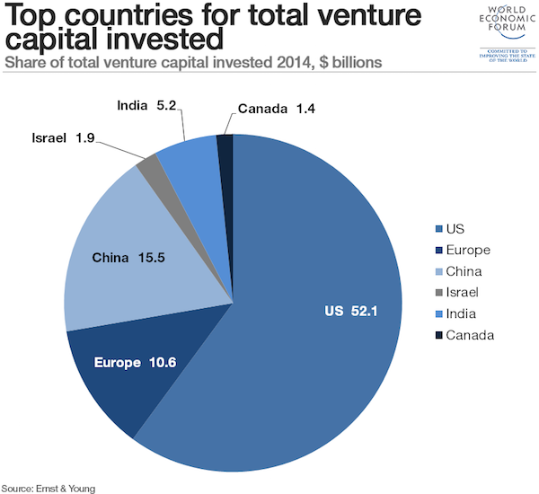
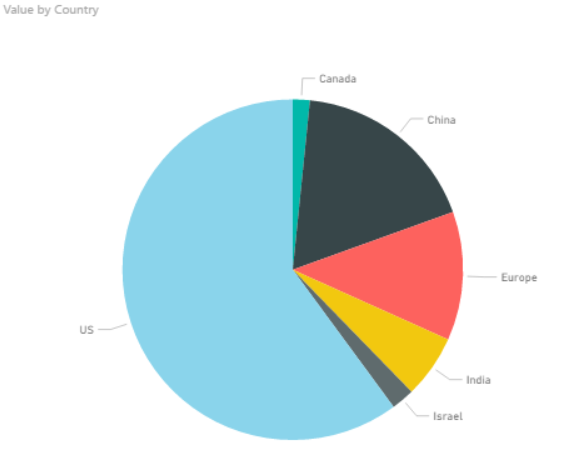
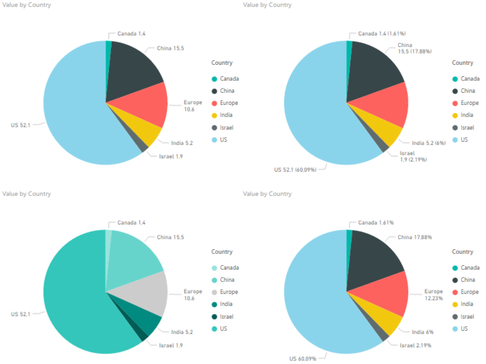
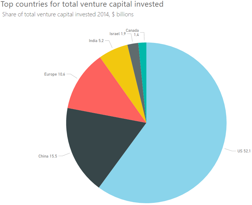
Andy Kirk has an excellent series called “The Little of Visualization Design” where he gives small tips and tricks that can improve your data visualizations. If you have not seen it I strongly recommend it. Now, what I am going to try and do every week after summer vacation is to try and show you have you can take these tricks and use them with Power BI. But let’s kick start it now with part 1, dual labeling. I suggest that you read the original post by Andy first so we are at a common ground about what we are going to look at which is this pie chart.
Dual labeling. It is suprisingly normal to see and it generates more cluster on your data visualisation than you need. Repeating something will not make things clearer, it will just create more ink on your graph and make it harder to focus on what’s important.
Now if you punch in the data and create a pie chart in Power BI we get what is shown below.
So Power BI does not provide you with a dual labeling issue at front, but it is quite easy to reproduce it with Power BI. In the “Format” pane you have a bunch of options which usually are great, but you have to use it with care and have a clear vision of why you are changing the original chart if not you can end up with all of these different variations.
The one in the bottom left is probably the closest to the one in the original post. It has dual labeling, and it has quite similar colors on the pie slices. Andy Kirk’s proposed solution is to remove the labeling and provide it directly onto the pie since the colors in the original graph is so similar. Now, that doesn’t sound to far away from the default graph that Power BI provides us with. However the default is not perfect and here is what I would do in order to improve it:
In Label Style choose “Category, data value”. This makes us see the actual number.
Increase font size of detail label.
Increase font size of the title. In general I think all default font sizes in Power BI are too small. I always feel like I need stronger contact lenses when creating a chart…
Sort the chart by value so the slices appear in order of size.
Note: I had originally made the font size of the detail label a bit bigger. However, this made the detail label for Canada disappear. Probably because it would take up the same space as Israel. So I wish they could make the position of the label a bit more dynamic.
In the end we end up with the chart below. So all in all the default chart Power BI created wasn’t too bad, but it could be improved. And make sure you are aware that not all options in the format pane in Power BI makes your data visualisation better, it could make it worse!
I’m looking forward to some weeks of summer and then I’ll continue this series when I am back! Thanks for reading. If you have any questions or feedback drop me a comment, it is greatly appreciated.
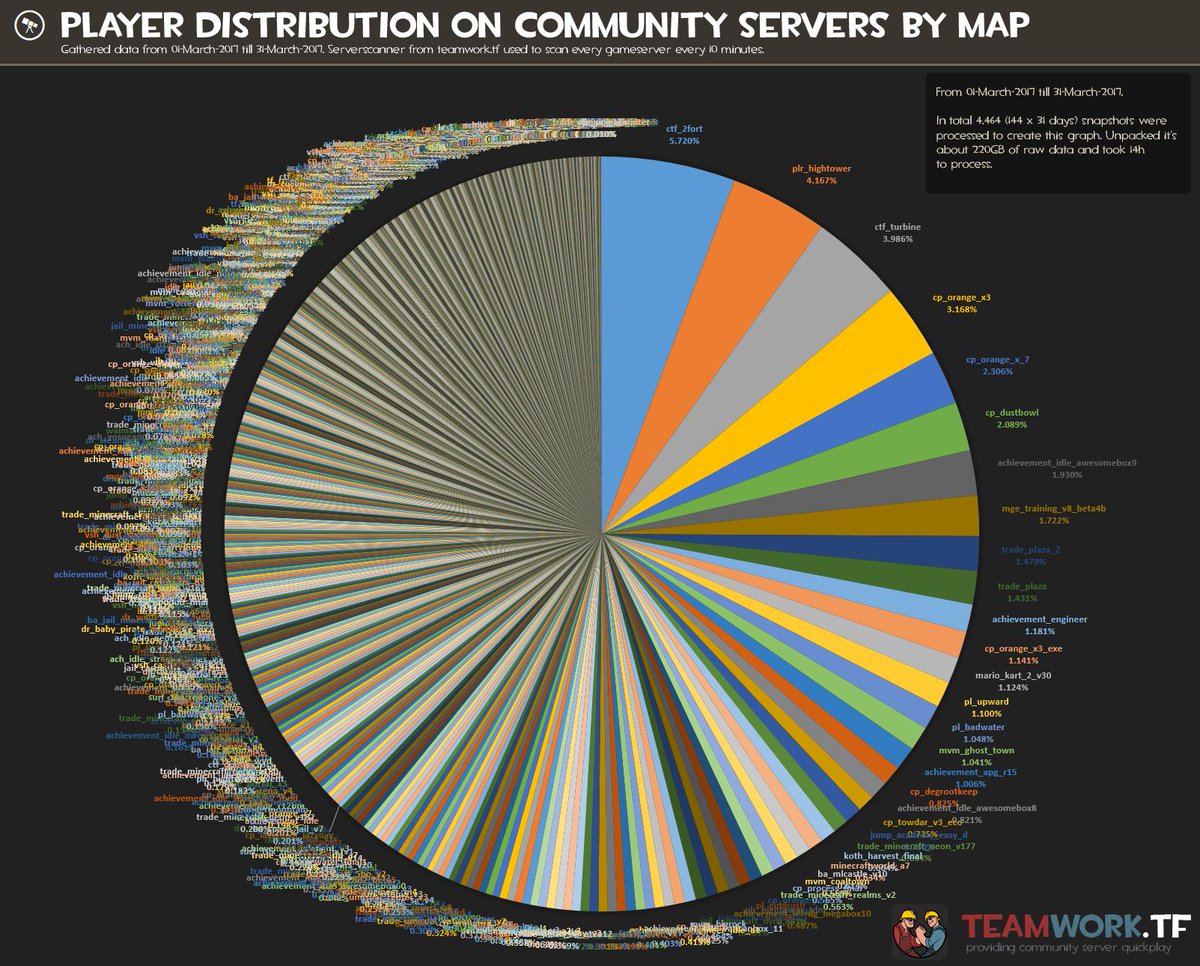
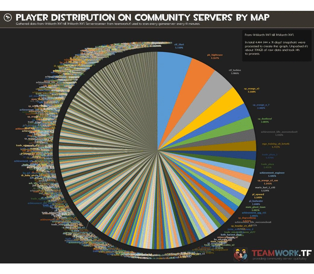
I am currently in the process of re-learning D3.js, a javascript library used for data visualisation. That means I am always looking interesting datasets or existing visualisations I can remake. Over at reddit.com/r/dataisbeautiful some time ago one of the busiest pie charts I have ever seen was posted. It was showing how many players was playing at certain maps in the game Team Fortress 2. Unfortunately there where over 14 000 slices in this pie chart and it just didn’t make much sense.
Worldst busiest pie chart
I used about 5 minutes in Power BI to create a remake that was a bar chart in order to show why that is a better graph choice to show ratio between different categories. However, as some other users commented that removed some of the complexity which also is quite interesting. The fact that more than 14 000 maps are being played at in a month in a game that is ten years old is quite impressive.
5 minute remake to show ratios better
So I ended up starting to think about a remake and asked the user who posted the pie chart if he had the dataset he had used. The internet is full of awesome people and in about one hour I had a csv files with 14 000 datapoints.
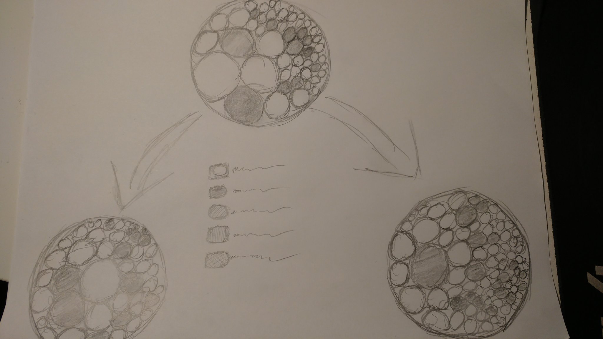
I have always gone code first, but I thought this time I would at least try to sketch some ideas on paper. I’m not the greatest at drawing, but that is also not the point. So I made this sketch. Initially I wanted to be able to create an overview which then could be broken down by some interaction. Unfortunately I did not have both the datasets I wanted at the time I built the visualisation, but I do now so maybe I have to revist this some time.
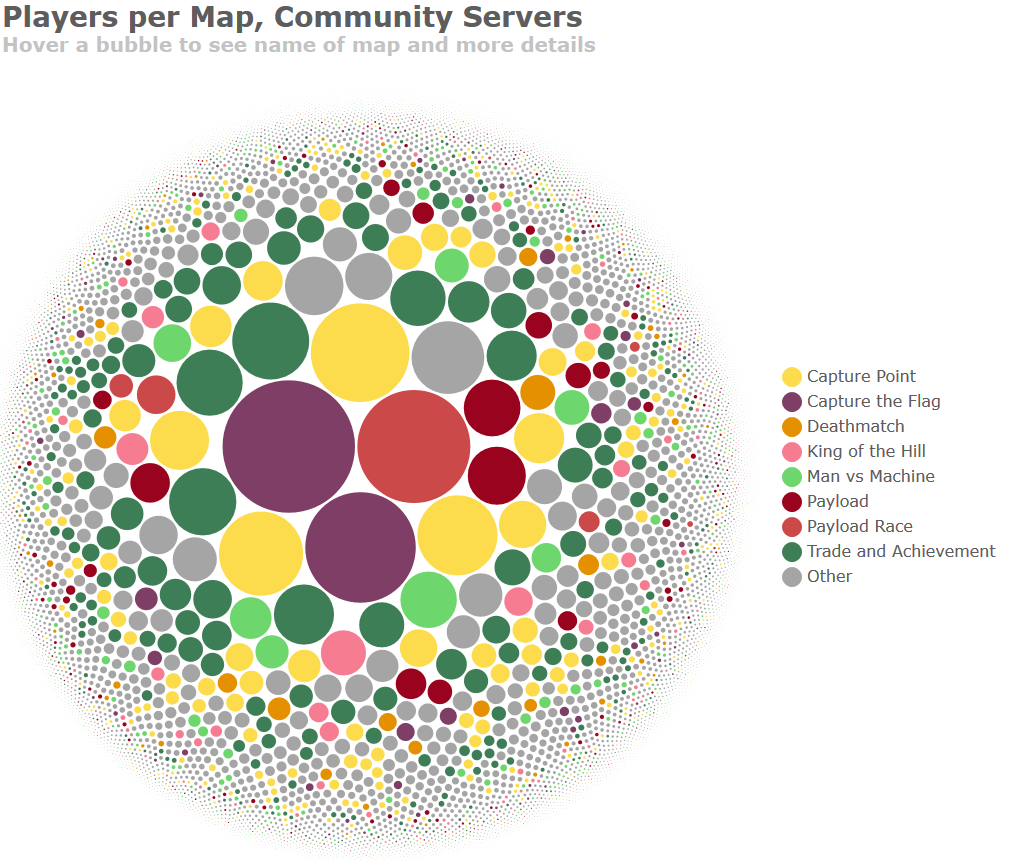
With that design in mind I built the visualisation. I’m not going to go into detail about how I did that here. You can see my cource code here if you want to have a look. The original is interactive so you can hover over a bubble to see more information.
Finished visualisation
Context, context, context
Now, even though I made an interactive version I ended up deciding to post a static image of the chart. That was a mistake. The original pie chart had created quite a bit of discussion at /r/dataisbeautiful so my head took it for granted that everyone knew what this represented. They did not. Internet is big, and not everyone lives in one subreddit. So many users did not get the background or the context, and even though I had written that in a comment, comments are not read by a lot of Reddit’s users. The chart had no context and as of today the comment with the highest rating still reads: “Looks nice but no fucking idea what anything is representing”.
However, a lot of people did actually get what I was trying to show. How complex and how distrubuted the player base in Team Fortess is. I have gone through the thread and followed up question and such and as long as you can filter out the trolls and take things as constructive feedback you can get some really nice feedback. Where else would you get feedback from many, many thousands of people on your work?
Context is hard on Reddit as a platform. You basically only have the title to explain as many users won’t read anything else, only look at the image.
I should have posted the interactive version. It provides some more detail that people where missing. I also, for some reason, had removed the text stating “hover over a bubble for more information” in the static image. Including that text might have made more people go to the interactive version.
Check more colorblind simulators. I used some simulators, but I think I forgot it with the last version. THere will be colorblind people when you share it with a userbase this big. If you need to test yours you can try this one.
People in general have a lower threshold for saying negative things so you need to be able to filter comments quite hard and which you decide to listen to.
It is written bubble, while boubble, as I had written all over the comments, is a river in France!
All in all, sharing your work is a really good exercise. Working on a project it is easy to go blind, but the internet won’t let you go easy if they see something to pick on.
If you create something you are proud of make sure to post it to /r/dataisbeautiful over at Reddit. We are always looking for original content!
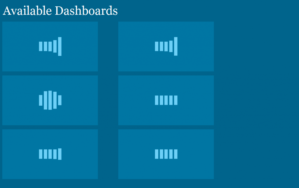
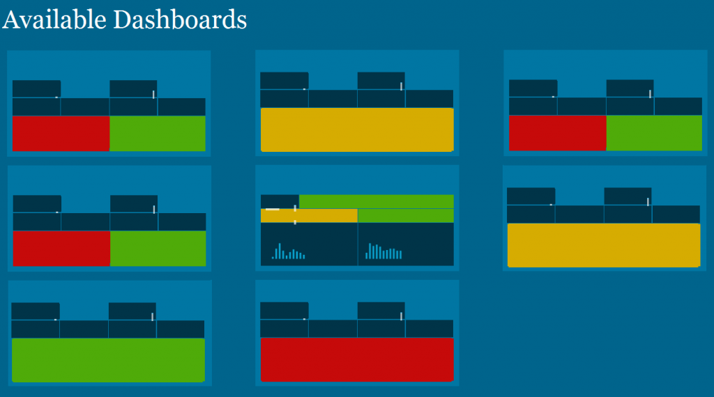
One of the projects I’ve used Datazen was a project that needed operational reporting. These dashboards was to be updated at least every 10 minutes and was placed on big screens around the work area where it was needed. We also created an overview, or landing page, for super users that needed to have quick access to all dashboards without waiting for the dashboards loop on the big screens.
In the beginning this landing page was just a static html site, as we didn’t want people to use the Datazen portal at that point. Every dashboard had a static thumbnail and when a user clicked on a thumbnail they were brought to the respective Datazen dashboard.
This worked fine, but it required every user to go into each dashboard to have a look at the status since the thumbnail did not change. So we decided to spend some time to create a dynamic landing page, or a dashboard of dashboards that showed real time thumbnails of the dashboards. By doing this they couldn’t necesserily see the numbers on all of the dashboards, but they would be able to see status and where things where green or red.
Datazen can be embedded in web pages by the use of iframes. Doing this gave us a more dynamic page that was refreshed when a user entered the site or after a given interval if they stayed on it. What you will notice if you try this is that a click on a dashboard will not open the dashboard itself, but instead you will be able to interact with the dashboard in the iframe. In our case, this was not what we wanted as the purpose was to just see the status and when a user clicked on a dashboard they were sent to that specific dashboard to get more details and in full screen.
In order to solve this we created a new <div> called clickCatcher with the same size as the Datazen “thumbnail”, and made transparent. This allowed us to display the dashboard in the size of a thumbanil, but open the dashboard when it was clicked instead of interacting with the small version. The code for one thumbnail is posted below.
It’s a neat little trick that made us able to create a solution that was easier, an better, for the customer. Too see how you we auto refreshed dashboard pages you can take a look here.
Datazen lets you create and use custom maps which can be a really useful feature. What I am using for creating these maps is good, old Paint, internet and QGIS, which you can download here, http://www.qgis.org/en/site/forusers/download.html.
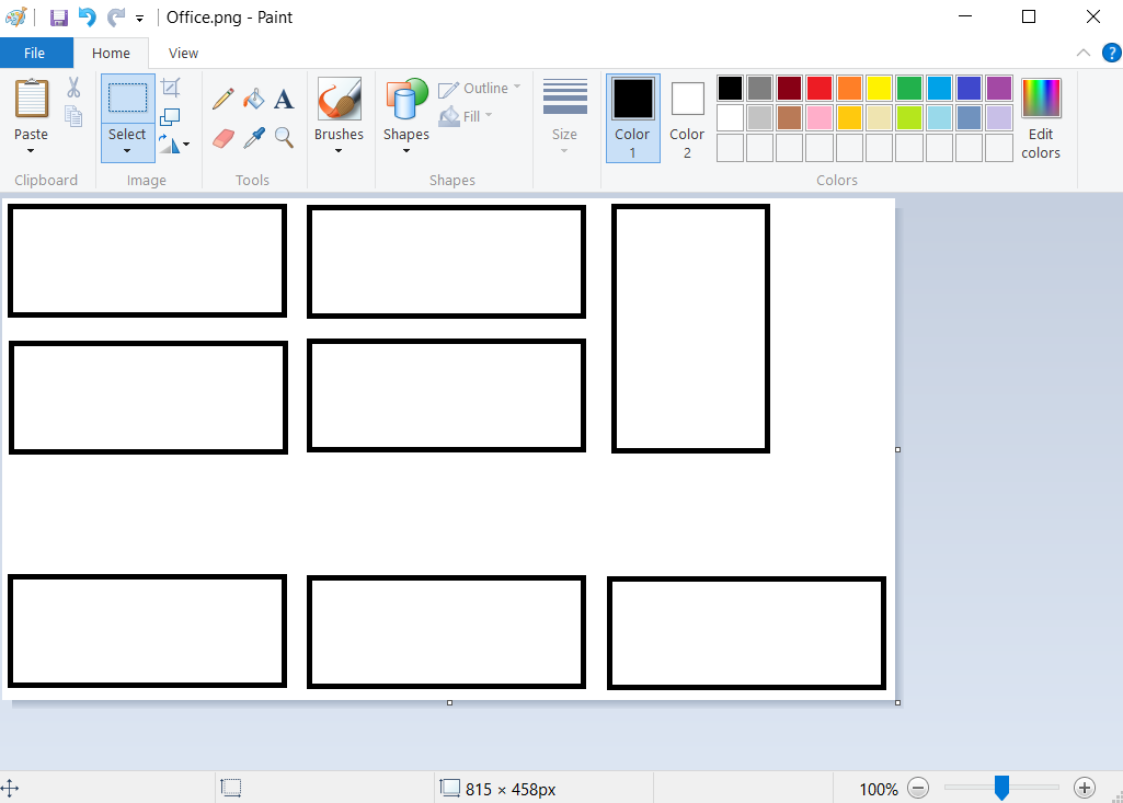
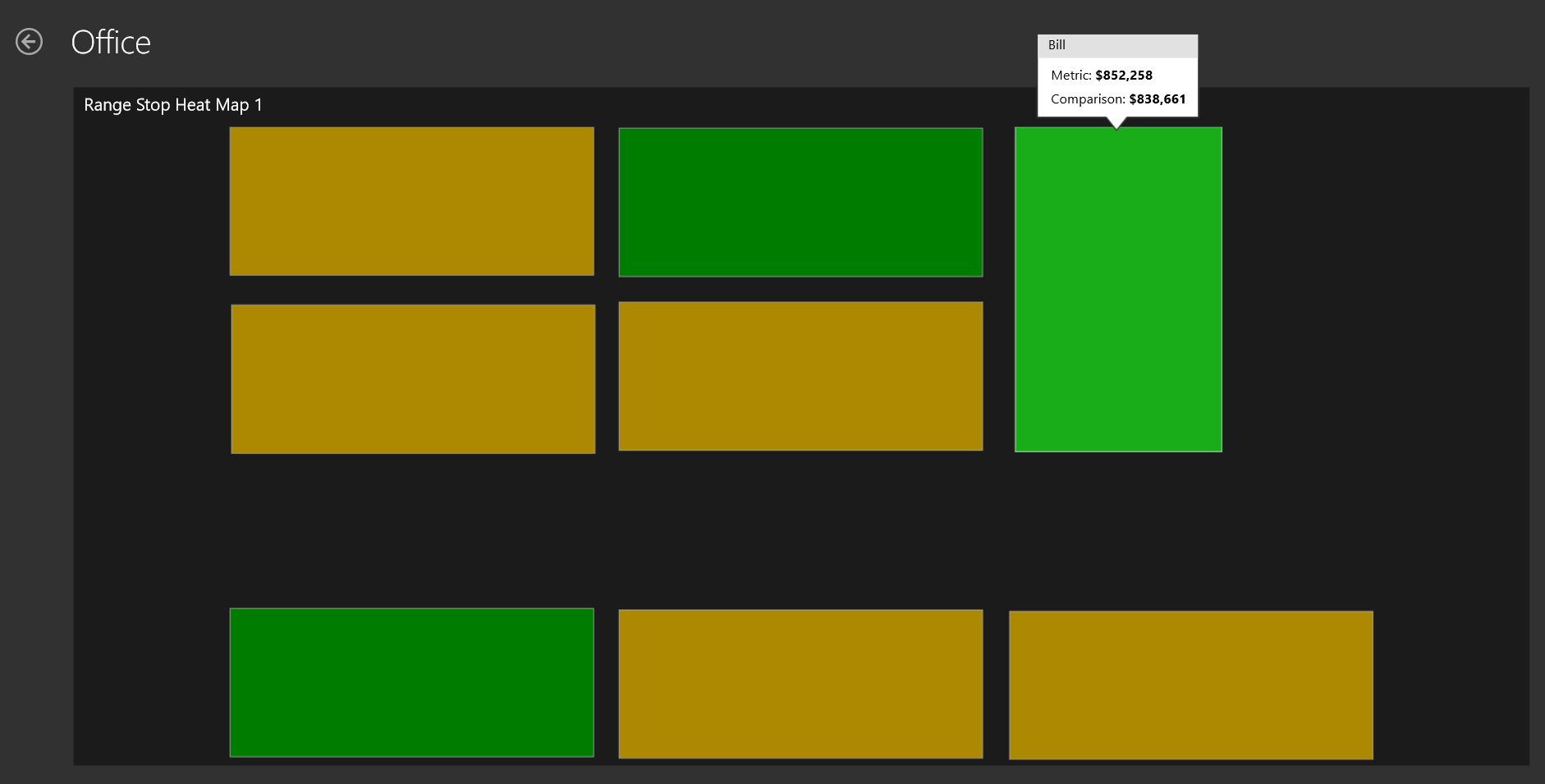
Say you want to create a map of your office. Maybe not the most useful map, but it is a small job to create an office layout in paint so lets start there. You can use other images as your starting point, but I want to make the entire thing from scratch to show that it is possible. My office will look like the one below with eight tables that I am going to map to different persons so we can see who actually does some work around the office! (None, of the names or data is real just to be sure)
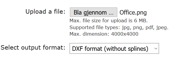
Next we need to convert this .png file to a vector file. I’m using http://www.autotracer.org/ for this, but there are other methods of doing it, software, other websites etc. Upload your file and make sure to choose DXF format on your output file.
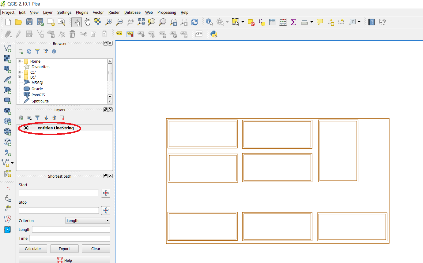
Now that we have a vector file of our office lets open up QGIS and just drag the .dxf file into it. Choose the default coordinate system and the layer with geometry type “linestring”. You should now have something like this in Qgis.
Right click your layer, choose “save as…” and choose ESRI shapefile in the popup. When this is done you can right click your “linestring” layer and remove it. We are now going to edit the shapefile a little to make it simpler and also give the different shapes the name of people in our office so we can map data to their names. Right click the layer and press toggle editing. You are now able to edit, merge or delete sections. We can see that our vector image has some double lines around each desk, probably because we used to thick of a brush in paint so lets remove them.
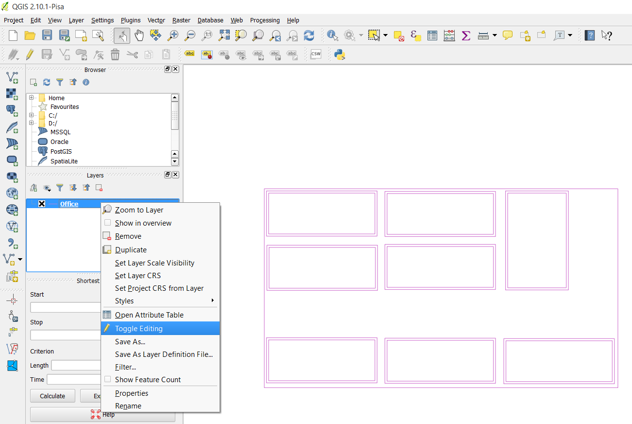
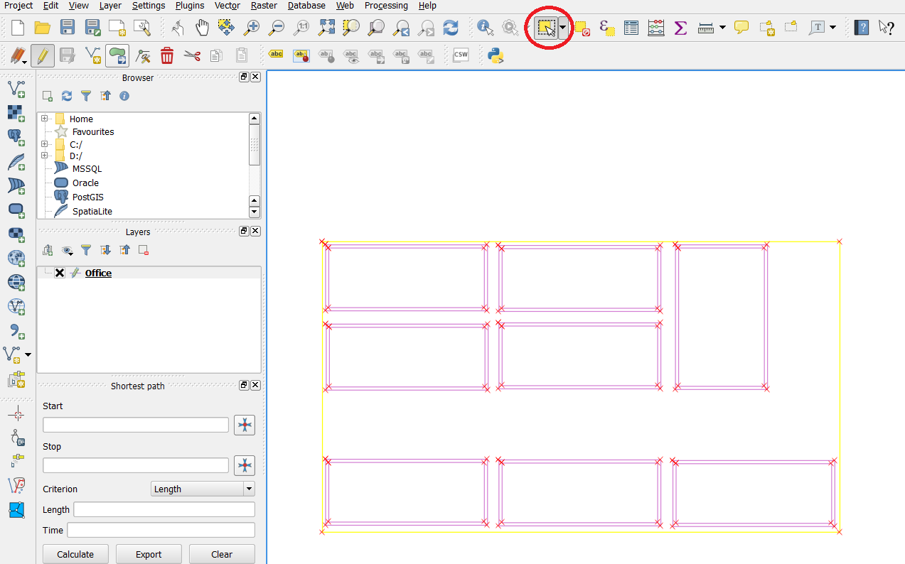
Find the “Select Feature” on your toolbar and select a section of your layer. This section becomes yellow and you can delete it. After deleting some of the sections I end up with a simple layer with eight squares, my office desks.
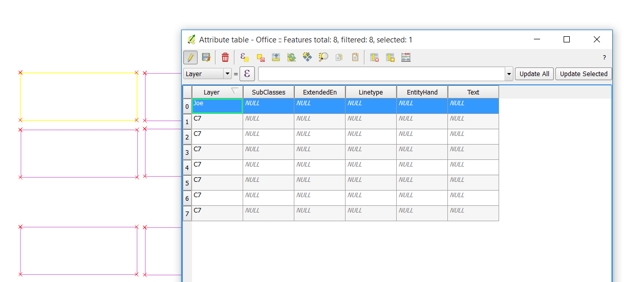
We need to give the shapes some more friendly names. Right click your layer and select “Open attribute table”. You get a popup and in my case I see that all my shapes has the name C7 in the layer column. I’m going to select a row in this attribute table, and see that by doing this the related section in my layer behind turns yellow. I now know which section I am editing and I’ll say that Joe works by this desk. Then I do the same for the rest of the sections.
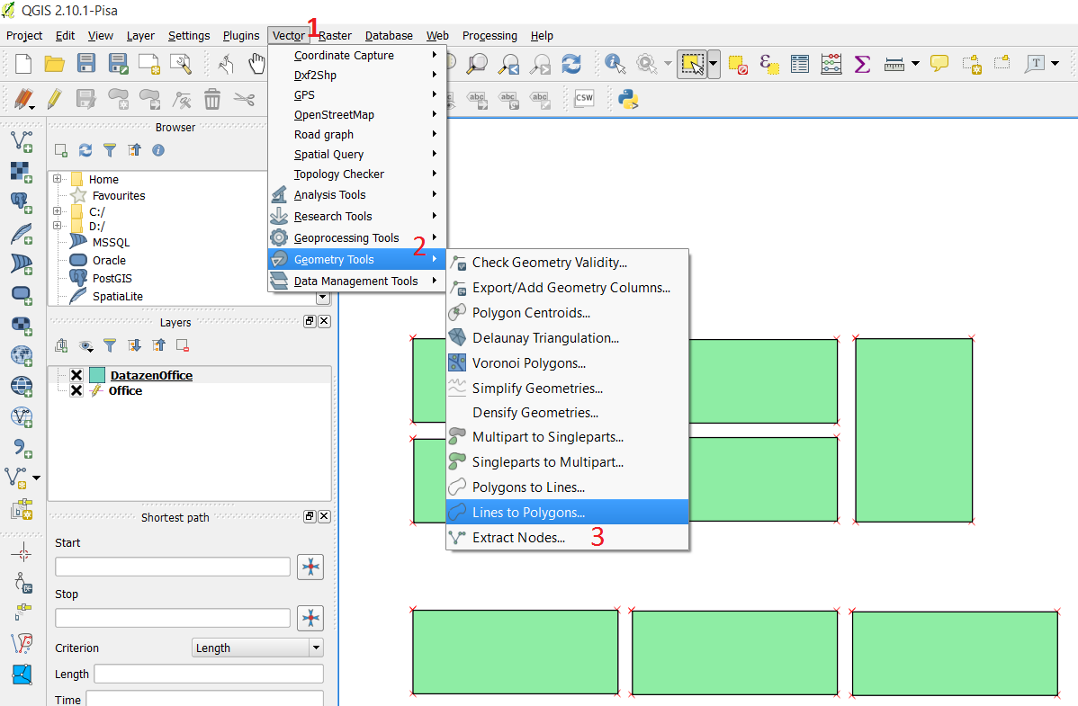
Save your layer after giving all rows a name. One more step and it is ready to be imported into Datazen. If you try to import it at this stage your data will only end up on the lines of the desk and it is REALLY hard to see what color it has. Press Vector -> Geometry tools -> Lines to polygon to make your lines into polygons, an area. You will need to create a new output shapefile and save that.
Alright, time to open up Datazen. Drag a map of your choice onto the Layout View, select “custom map from file” and find your shapefile. You will need the .shp and the .dbf file. Note: You can not have the shapefile open in QGIS at this point. It’s like reading from an Excel file, you can’t have it open when adding it to Datazen.
Press preview, and voila! You have created a map and inserted it into Datazen. Have fun, now the only limit is your mind or your customers need!