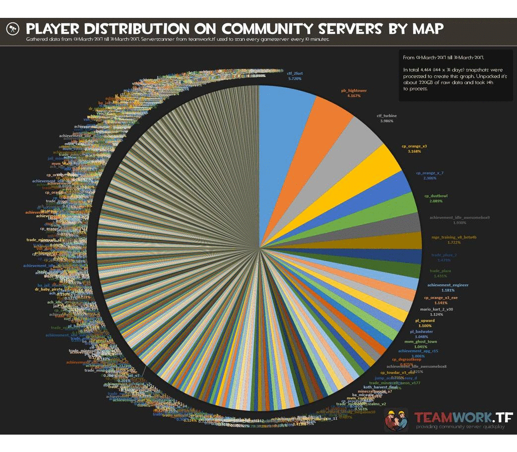
I am currently in the process of re-learning D3.js, a javascript library used for data visualisation. That means I am always looking interesting datasets or existing visualisations I can remake. Over at reddit.com/r/dataisbeautiful some time ago one of the busiest pie charts I have ever seen was posted. It was showing how many players was playing at certain maps in the game Team Fortress 2. Unfortunately there where over 14 000 slices in this pie chart and it just didn’t make much sense.
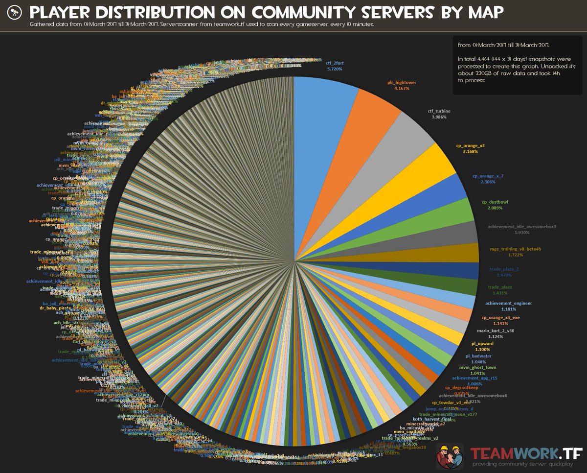
I used about 5 minutes in Power BI to create a remake that was a bar chart in order to show why that is a better graph choice to show ratio between different categories. However, as some other users commented that removed some of the complexity which also is quite interesting. The fact that more than 14 000 maps are being played at in a month in a game that is ten years old is quite impressive.

So I ended up starting to think about a remake and asked the user who posted the pie chart if he had the dataset he had used. The internet is full of awesome people and in about one hour I had a csv files with 14 000 datapoints.
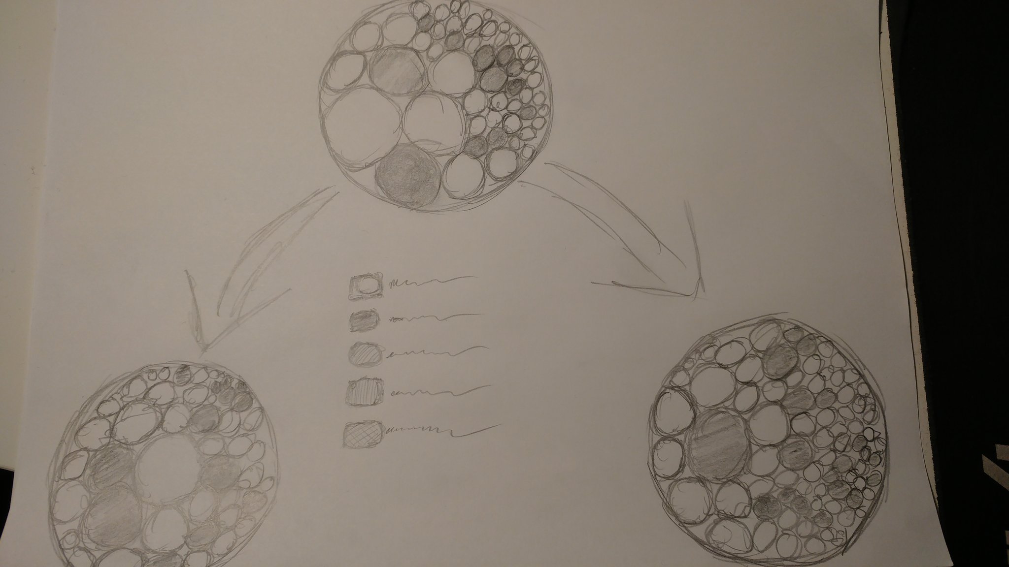
I have always gone code first, but I thought this time I would at least try to sketch some ideas on paper. I’m not the greatest at drawing, but that is also not the point. So I made this sketch. Initially I wanted to be able to create an overview which then could be broken down by some interaction. Unfortunately I did not have both the datasets I wanted at the time I built the visualisation, but I do now so maybe I have to revist this some time.
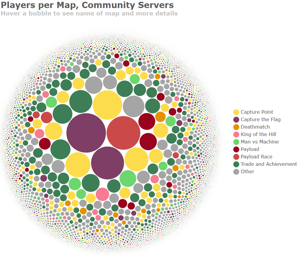
With that design in mind I built the visualisation. I’m not going to go into detail about how I did that here. You can see my cource code here if you want to have a look. The original is interactive so you can hover over a bubble to see more information.
Context, context, context
Now, even though I made an interactive version I ended up deciding to post a static image of the chart. That was a mistake. The original pie chart had created quite a bit of discussion at /r/dataisbeautiful so my head took it for granted that everyone knew what this represented. They did not. Internet is big, and not everyone lives in one subreddit. So many users did not get the background or the context, and even though I had written that in a comment, comments are not read by a lot of Reddit’s users. The chart had no context and as of today the comment with the highest rating still reads: “Looks nice but no fucking idea what anything is representing”.
However, a lot of people did actually get what I was trying to show. How complex and how distrubuted the player base in Team Fortess is. I have gone through the thread and followed up question and such and as long as you can filter out the trolls and take things as constructive feedback you can get some really nice feedback. Where else would you get feedback from many, many thousands of people on your work?
- Context is hard on Reddit as a platform. You basically only have the title to explain as many users won’t read anything else, only look at the image.
- I should have posted the interactive version. It provides some more detail that people where missing. I also, for some reason, had removed the text stating “hover over a bubble for more information” in the static image. Including that text might have made more people go to the interactive version.
- Check more colorblind simulators. I used some simulators, but I think I forgot it with the last version. THere will be colorblind people when you share it with a userbase this big. If you need to test yours you can try this one.
- People in general have a lower threshold for saying negative things so you need to be able to filter comments quite hard and which you decide to listen to.
- It is written bubble, while boubble, as I had written all over the comments, is a river in France!
All in all, sharing your work is a really good exercise. Working on a project it is easy to go blind, but the internet won’t let you go easy if they see something to pick on.
If you create something you are proud of make sure to post it to /r/dataisbeautiful over at Reddit. We are always looking for original content!