Tag Archives: PowerBI

Turning multiple values into one string in Power BI

Or concatenating if you will, but I don’t always remember that word which is probably why the solution didn’t come to me at once when I ran into the problem.

Concatenation is taking two or more values and chaining them, often with a delimiter. Like the first and last name of a person, or a zip code and the name of the area.

This demo data set is made up by looking at a persons grades in different classes they have taken. So if we want to show that information for all persons we would typically show it in a table like this.

Now what if we didn’t care to much about the grades for now, and wanted to show which classes a person had taken. We could of course just remove the Grade column and keep the table, but what if we only want to have one row per person? My gut feeling was playing with the matrix in Power BI, but that only shows the first value since this is a text column so it’s not what I am after at all.

The answer? Concatenation in a measure. Very often concatenation is done between two columns, but here I need it done on rows so the CONCATENATEX function is what we want. First I made this measure

Classes non distinct = CONCATENATEX(Example,Example[Class],”, “)

which gave this result

Looks ok, but the total row has duplicates in it and if we had grades for several years we would have it on each person as well if they had taken the same class several times and I only want the distinct values. Luckily we can then use the VALUES function to only get distinct values in a column so the measure now looks like this.

Classes = CONCATENATEX(VALUES(Example[Class]),Example[Class],”, “)

Which gives this result

Perfect! This can now be filtered and used like any other measure.

Power BI Quick Tip – Moving Shape to Background

Ever used shapes or images in Power BI and wanted a more flexible way of moving things forward and backwards on your canvas? Yeah, me to!

Under “View” there is a pane called “Selection Pane” and when checked you will see all the different elements on our page, and you can arrange them as you like where the ones on top of the list will be in the front of the elements below on your page. So if you use a shape for a background as me below, just pull it all the way to the bottom, and hepp! It is correctly placed as a background, and not covering the important stuff.

Activate the “Selection Pane” to reorder visuals
Before: My shape is in front of a lot of my graphs
After: My shape is correctly move to the background

Compare Sales With Last Year on Day in Week in Power BI

A very normal calculation we do is to compare a value, for example sales, against how we did last year. The easiest way to do this is by using the SAMEPERIODLASTYEAR function to create a measure that look like this

Sales LY = 
CALCULATE(
 [Sales]
 ;SAMEPERIODLASTYEAR(DimDate[Date])
)

Sales compared to Last Year on given dates

As shown in the image above this works fine for a given date, but what if we want to look at how one week compared to last year? For retailers this is a very normal demand. ow can we compare monday in one week to monday in the same week last year? After all it is a big difference in how much sales is being done on a Saturday compared to a Sunday, the shop might even be closed on sunday. For this we need to create a calculated column to help us out. We are going to call it DWY (for DayWeekYear) and we can do it like this

DWY = WEEKDAY(DimDate[Date])*1000000 
+ WEEKNUM(DimDate[Date])*10000 
+ YEAR(DimDate[Date])

Note: For people not using American calender you may need to prep week number  otherwise to get ISO week, for example in your date dimension. Then you can do the calculation. The important part is that is lines up with your definition of day in week, week number and year.

Sales for given dates with the new DWY column

Here you can see that 17th of September 2017 is a Monday, but in 2018 it is a Tuesday so we are unable to compare the two. Now, the beauty here with our new DWY column is that if we subtract one from a DWY date this year we get the same day in the same week last year. So, DWY Last Year = DWY -1. Which is great! So we can use this to create a measure that compares day in week vs the same day in week last year.

Sales LY Week =
Calculate
(
 [Sales]
 ;Filter(ALL(DimDate); DimDate[DWY] = Max( DimDate[DWY])-1)
)

Compare sales on day in week to last year

This works great when we look at a specific date, but you will see that the total row for the new measure is the same as the last value, and not the sum, so we have to extend it a little bit to make it sum up all the days we are showing. To do this we will use the SUMX function to create this measure

Sales LY Week Total =
SUMX
(
 VALUES(DimDate[DWY])
 ;FactSales[Sales LY Week]
)

Finished measure to compare day in week vs last years day in week

There you have it. But can we do more? In general I don’t like having more than one measure saying the same thing. We are looking at sales for last year in both measures we have created, it is just that one is comparing with a specific date and one is comparing with day in week. I would like to just have one measure that is Sales Last Year and then we can say that if the user is filtering on a week or a weekday we will show them the day in week last year value and otherwise we will show them the specific date. Now, this might be on a case to case scenario, but if you keep both measures available to they users they will have to remember that they cannot use the Sales LY Week Total measure if they want to look at a specific date, they have to use the “normal” Sales LY measure. In my experience this is often a source for user errors that might be confusing so we can hide this complexity by combining the measure we have created.

Sales LY Total =
IF
(
 ISFILTERED(DimDate[Week]) || ISFILTERED(DimDate[DayInWeek])
 ;FactSales[Sales LY Week Total]
 ;FactSales[Sales LY]
)

The finished result will behave as shown below. The same measure is used in both tables, but the one on the left is filtered on week while the one on the right is filtered by dates. If you have more ways of showing week or week day in your date dimension, like the week day name remember to include them in the IF statement to make them work as we want them to.

Sales filtered by Week (left) and dates (right)

The Little of Power BI Visualization Design – Part 2

Continuing our journey on applying Andy Kirks tips and tricks from his series “The Little of Visualization Design” we are now at part 2, Clever Axis Scaling. As last time I suggest you read his post first so we already have some common ground.

Why use clever axis scaling

Clever axis scaling is a tool in order to create some drama in your visualization. It can also help you highlight values and draw your consumers eye towards it. Things that stand out will get attention, our brain is simple in this regard, and in this case that is what we are after.

In the example the y-axis is set to 50, but the maximum value is 76. Now, my quick thought was “Great! this is easy, lets just set the y-axis to 50 so the helper line is 50”. This is easy to do, however the chart actually gets cut at 50. So it ends up looking the image below, which is not what we want at all. We are now hiding the most interesting data!

Max y-axis value set to 50 truncates your graph

So I tried setting it to 100. Now, that works okay, but the highest line on the y-axis is now not 50 so the dramatic effect of 76 shooting way above the last helper line on the y-axis disappears even though we still see the biggest increase on the chart to the left. So what is the solution? You need to try out what works best with your data. In this case it seems to work fine to choose 76, the maximum value in the chart. Now this will not always be the case because we can not control how many lines on the y-axis we get. If I make the chart higher you can see that the y-axis changes with numbers as well.

Trying out different max values on the Y-axis

Different heights can remove some of the effect we are after

Use it carefully

This solution also has the drawback that you are hardcoding the minimum and maximum value. So if you suddenly have a value higher than 76 you will loose it! In the end it comes down to what you want to tell with your chart, if your chart is going to change values often and how dramatic you want it. If you have no idea how your numbers will behave in the future I will not advice you to hard code min/max values unless you need it for a specific occation like a presentation. When you are done with that spesific occasion I suggest you turn them back to automatic to minimize confusion.

Final result

As with all tools PowerBI has some limitations compared to custom code and for example using something like D3.js where you can do absolutely everything you want! Having these limitation can make it a challenge to use all these tips and tricks  going forward, but we will do the best we can! In this case we might have some problems trying to create a more dramatic effect in our storytelling. Both with your axis’ as we have seen here, but also with data labeling as PowerBI does not let you choose which data points to highlight. So if you try to label the highest value without hovering over it it is not possible. Or at least I didn’t manage to, but if you do please let me know how you did it.

Also, if anyone has a way of hiding the ESRI logo in Power BI Desktop please let me know. They are not pretty and are driving me crazy!

Speaking at SQLSaturday Oslo, September 2nd 2017

I got some great new during my vacation I got a mail saying I was selected to give a talk at SQLSaturday in Oslo this year. I also got notified by the tweet below which I had completely forgotten from last year. Nice surprise to see I have succesfully made a goal of mine, even though I had forgotten I had set it! I’ve been to every SQLSaturday that has been in Oslo and it has always been a great event so looking forward to be able to contribute with a talk myself this year!

My talk is titled “Data Visualization – More Than a Hygiene Factor”, based on a quote from this Medium Post. You can read my abstract below.

"For many companies data visualization is still a hygiene factor; necessary but not crucial"

In a world where everyone wants to use data to drive their business forward it is important to be able to communicate and speak the language of data even though data itself can be complex. One way of doing this is by making good data visualisations. Good data visualisations are engaging, they are informative and they let your data tell you its story. Too often data visualisation gets a low priority making the final result feeling lacklustered and making the users uninspired. 

In this session we look at some data visualisation principles and best practices, in order to deliever your message with a clear point of view and minimize confusion. Lastly we will look at how you can use these practices with Power BI in order to improve how data can be communicated to your end users in the best possible way making them come back over and over.

SQLSaturday is a free 1-day training event for Microsoft Data Platform and SQL Server professionals, providing a variety of high-quality technical sessions. If you work on the Microsoft Data Platform SQLSaturday is a great way to get inspired and hear about new things. You can find more information about SQLSaturday, September 2nd in Oslo here!


“The Little of Visualization design” – with Power BI

Andy Kirk has an excellent series called “The Little of Visualization Design” where he gives small tips and tricks that can improve your data visualizations. If you have not seen it I strongly recommend it. Now, what I am going to try and do every week after summer vacation is to try and show you have you can take these tricks and use them with Power BI. But let’s kick start it now with part 1, dual labeling. I  suggest that you read the original post by Andy first so we are at a common ground about what we are going to look at which is this pie chart.

Dual labeling. It is suprisingly normal to see and it generates more cluster on your data visualisation than you need. Repeating something will not make things clearer, it will just create more ink on your graph and make it harder to focus on what’s important.

Now if you punch in the data and create a pie chart in Power BI we get what is shown below.

So Power BI does not provide you with a dual labeling issue at front, but it is quite easy to reproduce it with Power BI. In the “Format” pane you have a bunch of options which usually are great, but you have to use it with care and have a clear vision of why you are changing the original chart if not you can end up with all of these different variations.

The one in the bottom left is probably the closest to the one in the original post. It has dual labeling, and it has quite similar colors on the pie slices. Andy Kirk’s proposed solution is to remove the labeling and provide it directly onto the pie since the colors in the original graph is so similar. Now, that doesn’t  sound to far away from the default graph that Power BI provides us with. However the default is not perfect and here is what I would do in order to improve it:

  1. In Label Style choose “Category, data value”. This makes us see the actual number.
  2. Increase font size of detail label.
  3. Increase font size of the title. In general I think all default font sizes in Power BI are too small. I always feel like I need stronger contact lenses when creating a chart…
  4. Sort the chart by value so the slices appear in order of size.
    Note: I had originally made the font size of the detail label a bit bigger. However, this made the detail label for Canada disappear. Probably because it would take up the same space as Israel. So I wish they could make the position of the label a bit more dynamic.

In the end we end up with the chart below. So all in all the default chart Power BI created wasn’t too bad, but it could be improved. And make sure you are aware that not all options in the format pane in Power BI makes your data visualisation better, it could make it worse!

I’m looking forward to some weeks of summer and then I’ll continue this series when I am back! Thanks for reading. If you have any questions or feedback drop me a comment, it is greatly appreciated.

Creating a dynamic card with text value in Power BI

Alternative title: Finding string value from a dimension with highest numeric value

The company i work for uses Yammer and I have founded a Data Visualization group which I am, manually, keeping some statistics about using Power BI. The other day I found myself wanting a dynamic card in Power BI in order to highlight which day was the most active when it came to amount of posts. In order to do this I had to figure out how to make a measure returning not the max value, but the day which had the maximum amount of posts. My usecase is finding a weekday, but maybe you want to see which product is the most popular, which county has the most purchases or which salesperson has the most sales. All these cases should be able to reuse this measure.


First try

My inital thought was to create a table in my calculation and then slice it to return only one row and one column leaving me with one cell which had the day with the most number of posts. I made a measure which used a TOPN returning the row with most posts followed by a SELECTCOLUMN to select only the column which had the weekday in it. Now, this turned out to return me the overall correct day, but it did not work when I added a filter and the POwer BI visualization returned errors so I had to start over.


The solution

I have created three measures to solve this.

1) One simple sum of [Number of Posts]:


Number of Posts = SUM(Sheet1[NumberOfPosts])

2) Finding the day with the most posts by using MAXX


MaxPostsPerWeekDay = MAXX(VALUES(Sheet1[WeekDay]);[Number of Posts])

3) Using FIRSTNONBLANK on my WeekDay column and then return the value where the sum equals the maximum value. So in the end my measure looks like this.

Most Popular Day = 
IF(
    ISBLANK([Number of Posts]);
    BLANK();
    FIRSTNONBLANK(
        Sheet1[WeekDay];
        IF(
            [Number of Posts] =
            CALCULATE(
                [MaxPostsPerWeekDay];
                VALUES(Sheet1[WeekDay])
            );
            1;
            BLANK()
        )
    )
)

The first IF is to remove days that has no posts, in my case there is not much activity in the weekends so they will get filtered out. The beauty of this measure is that it is not limited to crads, but also easy to use with your filters and in tables where you would want it.

Creating a guest user for Datazen

If you ever want to have public access to your dashboards you can get this by creating a guest user and giving that user access to the dashboards you want to be publicly available. This is great if you want to place dashboards on a web page without haveing the users to log in to see them.

You can create a guest user by creating a new user on the server with this info:
Username: guest
Mail: guest@guest.com
Name: Guest

Now, remember that this user should only have access to dashboards that is intended for everyone to see. If you give it access to everything, business critical information can be available to anyone.

Using JSON functions in SQL Server 2016

With SQL Server 2016 we are finally able to analyze and query JSON data. It is not that often I use XML, but JSON is so much used it is about time we can use it in SQL Server. In this entry I’ll let you follow me as I take a first look at it using some data from New York Times.

New York Times has a web app called Chronicle, which lets you see how many articles has mentioned specific words and this data you can also export as JSON. I chose to use the words Radio, Televion, Mail and Internet and downloaded one JSON file per word (for some reason it doesn’t work to get the data for several terms at once). I also chose to remove one of the sets of square parenthesis since our graph_data only will have one term and not a list of terms. I end up with four files that looks like this.

graph_data

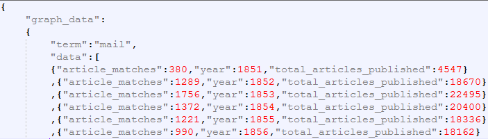
So the graph_data has a term that in our case is mail, radio, television and internet and an array of data which has the number of articles containing the number of articles with the term, the year and the total number of articles published in that year so we for example can calculate a percentage of how many articles the term was in.

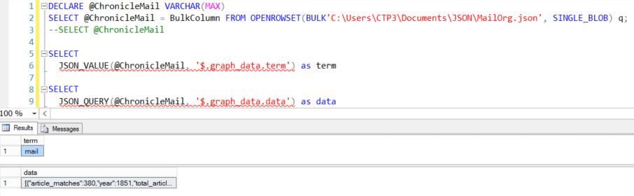
In order to read the JSON from the file I first load the entire file into a variable using the following code

DECLARE @ChronicleMail VARCHAR(MAX)
SELECT @ChronicleMail = BulkColumn FROM OPENROWSET(BULK'C:\Users\CTP3\Documents\JSON\MailOrg.json', SINGLE_BLOB) q;
SELECT @ChronicleMail

The last line selects the text so we can have a look at what is saved in the variable, which basicly is just one long string.

Not so interesting so far, but lets start using the new JSON functions. The JSON_VALUE function returns one scalar value from a JSON string. If you try using JSON_VALUE on something returning an array you will get a NULL returned. To get an array returned you must use the JSON_QUERY function. This is fine, but if you want to insert your data into a table the function you want to use is the OPENJOSN that lets you reference some array in your JSON and then return the elements.

JSONValueAndQuery

In our case the data is an array so lets call OPENJSON and call it on the data.

SELECT
    *
FROM OPENJSON(@ChronicleMail, '$.graph_data.data')

JSONData

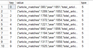
From the result set we can see that we now have one row per year in our data. Now that is cool and all, but we kind of want the values in different columns, not the entire JSON in a column with name value. To fix this you can add a WITH clause after the OPENJSON function.

SELECT 	
	[NumberOfArticles]
	,[TotalArticles]
	,[Year]
FROM OPENJSON(@ChronicleMail, '$.graph_data.data')
WITH(
	[NumberOfArticles] int '$.article_matches',
	[Year] int '$.year',
	[TotalArticles] int '$.total_articles_published'
)

JSONDataColumns

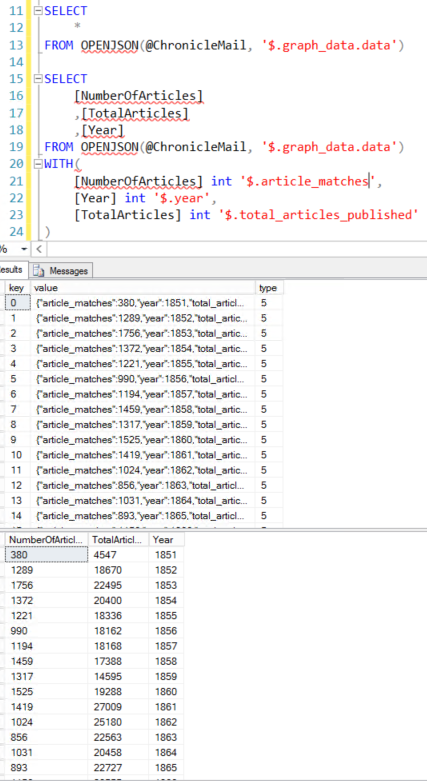
Excellent! We now have the data in a table structure and we can insert into an actual table or do whatever we want with it. I wanted to add the term to the data so I ended up just joining it to this dataset using the JSON_VALUE function to pull only the term.

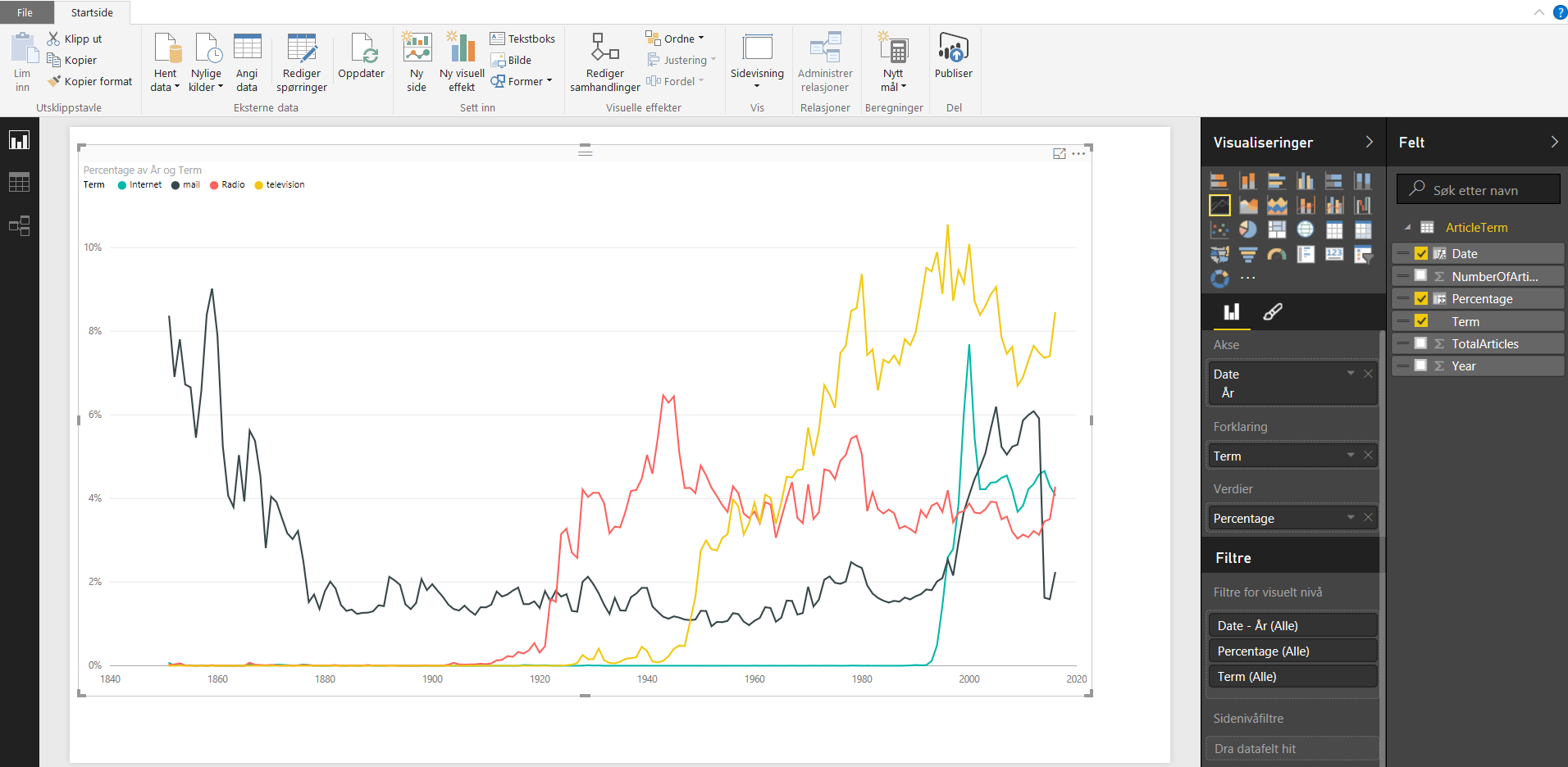
After doing this for all for files I know have a table with all terms and data for each year and I am free to use whatever tool I’d like to visualize it, f.ex PowerBI or Datazen, or since we’re in SQL Server 2016 now we can make a mobile report in SSRS. I chose PowerBI for now and added a calculation for percentage and also added year as a date to produce this.

PowerBI

Lastly, not sure if fun fact worthy, but if you would have used the OPENJSON directly on graph_data you will be able to see the key and datatype of the other elements and from this you will see that you would have to use JSON_VALUE for the key term, while the JSON_QUERY for the key data since it is an array. All in all I think these JSON functions is a great addition to SQL Server in 2016, I am sure I will be using them quite a bit!

Datazen Branding

It is possible to do branding in Datazen so you can use your own backgrounds, create a custom color palette, etc. However in the product documentation it is only listed the names of the files you need in this brand package. It does not show you how the layout of the files that are not image files should look like so you can create the images, but not the complete brand package.

I have tried to get a hold of how these files should be created for a while, and yesterday luck finally stroke. So, a big thanks to @cmfinlan for sharing a brand package template. You can find the template below. Enjoy creating custom branding for your needs, and may all your maps be pink!

BrandTemplate

PinkMap