Creating a Dynamic Dashboard of Datazen Dashboards

One of the projects I’ve used Datazen was a project that needed operational reporting. These dashboards was to be updated at least every 10 minutes and was placed on big screens around the work area where it was needed. We also created an overview, or landing page, for super users that needed to have quick access to all dashboards without waiting for the dashboards loop on the big screens.

In the beginning this landing page was just a static html site, as we didn’t want people to use the Datazen portal at that point. Every dashboard had a static thumbnail and when a user clicked on a thumbnail they were brought to the respective Datazen dashboard.

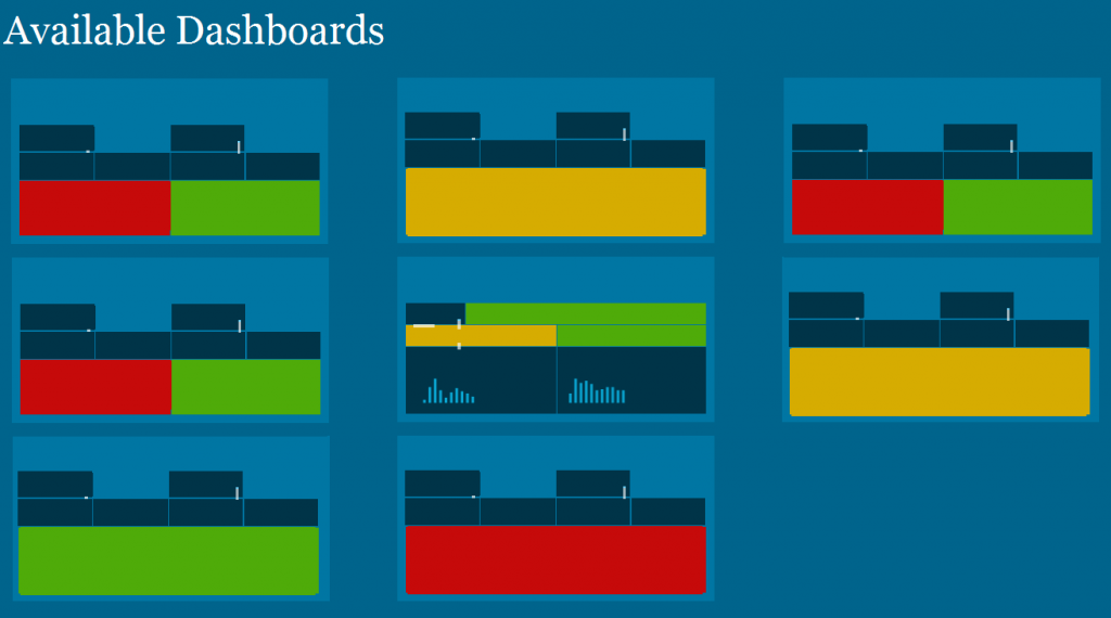
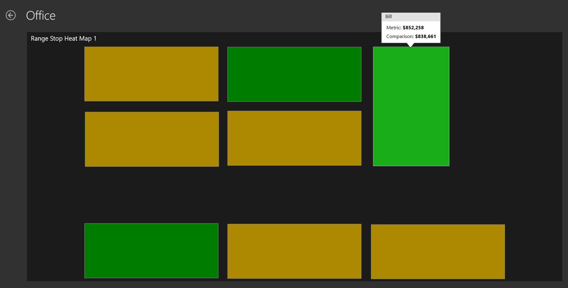
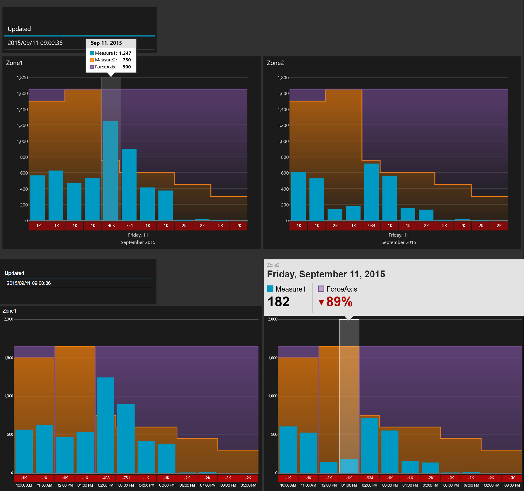
This worked fine, but it required every user to go into each dashboard to have a look at the status since the thumbnail did not change. So we decided to spend some time to create a dynamic landing page, or a dashboard of dashboards that showed real time thumbnails of the dashboards. By doing this they couldn’t necesserily see the numbers on all of the dashboards, but they would be able to see status and where things where green or red.

Datazen can be embedded in web pages by the use of iframes. Doing this gave us a more dynamic page that was refreshed when a user entered the site or after a given interval if they stayed on it. What you will notice if you try this is that a click on a dashboard will not open the dashboard itself, but instead you will be able to interact with the dashboard in the iframe. In our case, this was not what we wanted as the purpose was to just see the status and when a user clicked on a dashboard they were sent to that specific dashboard to get more details and in full screen.

In order to solve this we created a new <div> called clickCatcher with the same size as the Datazen “thumbnail”, and made transparent. This allowed us to display the dashboard in the size of a thumbanil, but open the dashboard when it was clicked instead of interacting with the small version. The code for one thumbnail is posted below.

It’s a neat little trick that made us able to create a solution that was easier, an better, for the customer. Too see how you we auto refreshed dashboard pages you can take a look here.

HTML

<div id="kpi" class="kpi">
<a href="LinkToDashboardPage" class="thumb">
<div class="clickCatcher"></div>
<iframe src="LinkToPublicDatazenDashboard" style="overflow:hidden;overflow-x:hidden;overflow-y:hidden" frameborder="0" height="157px" width="300px"></iframe>
</a>
</div>

CSS

.clickCatcher{
display: block;
background-color:rgba(255, 0, 0, 0.0);
height: 157px;
width: 300px;
position: absolute;
}

LoadingDashboards
All dashboards are refreshed when the landing page is opened
DashboardDashboardExample
How the dashboard might look. Clicking on a thumbnail will take you to the full size dashboard


Everyone should try improvisation at least once

Improvisation, a word that scares many people, appeals to some and a skill everyone uses without perhaps thinking about it. During my time at university I spent about four years doing improvisation theater. At that point in time it was a way for me to relax and do something completely different than studying, but when I look back at it now there are some many things I learned doing improv that I now use every day in my work life. In my opinion everyone should try to do improv at least once during their life.

When I mention I used to do improvisation many react with “How did you dare to do that? I wouldn’t know what to do!”, but had they thought out how this conversation with me would be before it started? Had they every line thoughtout before it started? Every day everyone improvises, life doesn’t come with a script. It might be in a meeting at work, with your kids, friends or family, you don’t have to be on stage to do it. There are some valuable points that are important in improvisation, but that I also believe everyone would benefit from having training in, and doing improv is just one way of doing this.

COMMUNICATION

When I ask people what they think about improvisation if they have seen it on stage they say it is funny, and improv is fun, but being funny is not the fundamental thing in improvisation. In my opinion the most important thing about improvisation is communication, and listening to the ones you interact with on stage, or off stage. If you don’t listen to what the other persons are saying you will not be able to tell a story that seems cohesive. If one actor tries to force his story through the other actors it will get noticed by the audience and the result is usually worse than if they had reacted to what was happening elsewhere and built upon that.

Now think about a meeting you have been in where some people clearly are not ready to listen to what the other meeting attendants have to say. Others try to come with suggestion, but they just keep forcing their view through. When you leave the meeting you feel like you have not been heard and maybe a feeling that the outcome was not the best it could have been. The communication only went one way and they where simply not open for new input. Which brings me to the next point.

SAYING YES

I remember this as one of the hardest things to learn, saying yes, and not block ideas from others. If you say no to a suggestion on stage, called blocking, you have killed the momentum in a story. Saying no is so much easier though, both on stage or in real life. By saying no, you don’t have to continue on what was started, you can start over with your own idea, but real magic happens when people say yes to new ideas and build upon them.

How easy isn’t it to say no to a new idea in a meeting? It is also quite lazy by the people saying no right away, you don’t need to think what this new idea means, what could come from it or how it can affect you, your company or your customers. I try to go into every meeting open minded, listen to what people say and every time a new idea comes up use at least a couple of seconds before I respond. Not all ideas are good, but I believe all ideas, and their creators, deserves to feel like they have been heard, and maybe someone else will be able to spin a new idea out from the original.

Try it out, say yes to more and think about how often your say no to things or ideas. Saying yes is not as easy as it sounds.

MENTAL EXERCISE

Communication and saying yes is what I believe is the two most important things I brought with me from doing improvisation, but iprov is also a great mental exercise and a way of really pushing your imagination and brain in a way it might not have been challenged before. When we had our weekly training we did some training on techniques to use on stage, but also a lot of games to expand our imagination and brain processing speed. ALl of this to be prepared to create magic on stage, but also to get to know everyone in the group and feel safe around them. And again this are things that relates directly to work life. In teams where there is a relaxed and safe environment people will dare to say the ideas they have, and I also think they will have more fun and be more productive. Knowing that your team will back yoo up and help you when you struggle or do a mistake is worth gold.

If you have the opportunity to attend an improvisation course I strongly recommend you try it out even though it might seem scary at first. You might get so much out of it, I know I have.

If you want to read more about improv I can recommend the book Improv by Keith Johnstone as a starter.

SunsetPeople

Datazen Guest Authentication Will Be Missed

About a week ago a blog post was released called “Announcing End of SUpport for Datazen Products“. Now, this shouldn’t come as a surprise since Datazen is a part of Reporting Services in SQL Server 2016, more specifically mobile reports. Overall this is great news, there was however a few points I was a bit disappointed in seeing was not part of the initial release.

A really great thing that is mentioned is that a focus area has been that Datazen customers should be able to migrate to SQL Server 2016 Reporting Services easily. This is great, no need in recreating everything you have done so far, and there has been mentioned a migration tool earlier so I hope this will be a simple case once customers start migrating HUBs, users and dashboards.

My biggest dissapointment was to see that Custom authentication and Public/guest authentication is not part of the initial release, but at least on the roadmap. I have struggled with SSRS on public webpages before, and Datazen gave me an easy way of doing this. Hacking a way so that a public Sharepoint portal had to impersonate a user when a user went to pages with SSRS elements was not an easy task, and that hack also did not work when the site was migrated from SharePoint 2010 to SharePoint 2013 so we had to do it all over again. And this was even the solution that Microsoft themselves said we should go for!

Authentication via SSRS have some clear advantages, but I’m still dissapointed that there was not room for guest authentication. In the end, a lot of information is usable and important for the public, and if it is not seen what use is it? I’m crossing my fingers that this will be implemented relatively quick. If we’re lucky maybe they are able to let us use SSRS paginated reports on public sites as well!

Creating a guest user for Datazen

If you ever want to have public access to your dashboards you can get this by creating a guest user and giving that user access to the dashboards you want to be publicly available. This is great if you want to place dashboards on a web page without haveing the users to log in to see them.

You can create a guest user by creating a new user on the server with this info:
Username: guest
Mail: guest@guest.com
Name: Guest

Now, remember that this user should only have access to dashboards that is intended for everyone to see. If you give it access to everything, business critical information can be available to anyone.

Using JSON functions in SQL Server 2016

With SQL Server 2016 we are finally able to analyze and query JSON data. It is not that often I use XML, but JSON is so much used it is about time we can use it in SQL Server. In this entry I’ll let you follow me as I take a first look at it using some data from New York Times.

New York Times has a web app called Chronicle, which lets you see how many articles has mentioned specific words and this data you can also export as JSON. I chose to use the words Radio, Televion, Mail and Internet and downloaded one JSON file per word (for some reason it doesn’t work to get the data for several terms at once). I also chose to remove one of the sets of square parenthesis since our graph_data only will have one term and not a list of terms. I end up with four files that looks like this.

graph_data

So the graph_data has a term that in our case is mail, radio, television and internet and an array of data which has the number of articles containing the number of articles with the term, the year and the total number of articles published in that year so we for example can calculate a percentage of how many articles the term was in.

In order to read the JSON from the file I first load the entire file into a variable using the following code

DECLARE @ChronicleMail VARCHAR(MAX)
SELECT @ChronicleMail = BulkColumn FROM OPENROWSET(BULK'C:\Users\CTP3\Documents\JSON\MailOrg.json', SINGLE_BLOB) q;
SELECT @ChronicleMail

The last line selects the text so we can have a look at what is saved in the variable, which basicly is just one long string.

Not so interesting so far, but lets start using the new JSON functions. The JSON_VALUE function returns one scalar value from a JSON string. If you try using JSON_VALUE on something returning an array you will get a NULL returned. To get an array returned you must use the JSON_QUERY function. This is fine, but if you want to insert your data into a table the function you want to use is the OPENJOSN that lets you reference some array in your JSON and then return the elements.

JSONValueAndQuery

In our case the data is an array so lets call OPENJSON and call it on the data.

SELECT
    *
FROM OPENJSON(@ChronicleMail, '$.graph_data.data')

JSONData

From the result set we can see that we now have one row per year in our data. Now that is cool and all, but we kind of want the values in different columns, not the entire JSON in a column with name value. To fix this you can add a WITH clause after the OPENJSON function.

SELECT 	
	[NumberOfArticles]
	,[TotalArticles]
	,[Year]
FROM OPENJSON(@ChronicleMail, '$.graph_data.data')
WITH(
	[NumberOfArticles] int '$.article_matches',
	[Year] int '$.year',
	[TotalArticles] int '$.total_articles_published'
)

JSONDataColumns

Excellent! We now have the data in a table structure and we can insert into an actual table or do whatever we want with it. I wanted to add the term to the data so I ended up just joining it to this dataset using the JSON_VALUE function to pull only the term.

After doing this for all for files I know have a table with all terms and data for each year and I am free to use whatever tool I’d like to visualize it, f.ex PowerBI or Datazen, or since we’re in SQL Server 2016 now we can make a mobile report in SSRS. I chose PowerBI for now and added a calculation for percentage and also added year as a date to produce this.

PowerBI

Lastly, not sure if fun fact worthy, but if you would have used the OPENJSON directly on graph_data you will be able to see the key and datatype of the other elements and from this you will see that you would have to use JSON_VALUE for the key term, while the JSON_QUERY for the key data since it is an array. All in all I think these JSON functions is a great addition to SQL Server in 2016, I am sure I will be using them quite a bit!

Datazen Branding

It is possible to do branding in Datazen so you can use your own backgrounds, create a custom color palette, etc. However in the product documentation it is only listed the names of the files you need in this brand package. It does not show you how the layout of the files that are not image files should look like so you can create the images, but not the complete brand package.

I have tried to get a hold of how these files should be created for a while, and yesterday luck finally stroke. So, a big thanks to @cmfinlan for sharing a brand package template. You can find the template below. Enjoy creating custom branding for your needs, and may all your maps be pink!

BrandTemplate

PinkMap

One way of auto refreshing Datazen in your browser

Yesterday I saw Christopher Finlan tweet about one way of making your Datazen dashboard auto refresh. He used a Firefox add-in for this, and I’d like to show you how I have been doing this.

If you want to show Datazen on a big screen there is at this point no out-of-the-box way to auto refresh your dashboard, meaning you have to open it to get new data. If you use the browser viewer you can quite quickly create one of the simplest websites in the world to do this.

In the header of your .html file add the following line:

<meta http-equiv="refresh" content="90" />

It will make your page refresh every 90 seconds. This can also be used if you want to circle some of your dashboards, sort of like a carousel. The line below will after 30 seconds go to the specified URL instead of just refreshing the page. To complete the circle make sure to go to the first dashboard in your last dashboard.

<meta http-equiv="refresh" content="30; URL='NextDashboard'">

So what does the .html file look like for the easiest example? Something like this, just exchange “DashboardURL” with your URL:

<!DOCTYPE html>
<html>
<head>
<title>Name of Dashboard</title>
<meta http-equiv="refresh" content="90 ">
</head>
<body style="margin:0px;padding:0px;overflow:hidden">
<iframe src="DashboardURL" frameborder="0" style="overflow:hidden;overflow-x:hidden;overflow-y:hidden;height:100%;width:100%;position:absolute;top:0px;left:0px;right:0px;bottom:0px" height="100%" width="100%"></iframe>
</body>

Note: If you are going to setup an auto refresh I’d suggest you also set up your guest account so you can have access to those dashboards without having to login. You can then use the public dashboard URL in the source of your iframe.

Creating a custom map for Datazen

Datazen lets you create and use custom maps which can be a really useful feature. What I am using for creating these maps is good, old Paint, internet and QGIS, which you can download here, http://www.qgis.org/en/site/forusers/download.html.

Say you want to create a map of your office. Maybe not the most useful map, but it is a small job to create an office layout in paint so lets start there. You can use other images as your starting point, but I want to make the entire thing from scratch to show that it is possible. My office will look like the one below with eight tables that I am going to map to different persons so we can see who actually does some work around the office! (None, of the names or data is real just to be sure)

Office

Next we need to convert this .png file to a vector file. I’m using http://www.autotracer.org/ for this, but there are other methods of doing it, software, other websites etc. Upload your file and make sure to choose DXF format on your output file.

convert

Now that we have a vector file of our office lets open up QGIS and just drag the .dxf file into it. Choose the default coordinate system and the layer with geometry type “linestring”. You should now have something like this in Qgis.

qgisOutline

Right click your layer, choose “save as…” and choose ESRI shapefile in the popup. When this is done you can right click your “linestring” layer and remove it. We are now going to edit the shapefile a little to make it simpler and also give the different shapes the name of people in our office so we can map data to their names. Right click the layer and press toggle editing. You are now able to edit, merge or delete sections. We can see that our vector image has some double lines around each desk, probably because we used to thick of a brush in paint so lets remove them.

toggelEditing

Find the “Select Feature” on your toolbar and select a section of your layer. This section becomes yellow and you can delete it. After deleting some of the sections I end up with a simple layer with eight squares, my office desks.

SelectFeature

We need to give the shapes some more friendly names. Right click your layer and select “Open attribute table”. You get a popup and in my case I see that all my shapes has the name C7 in the layer column. I’m going to select a row in this attribute table, and see that by doing this the related section in my layer behind turns yellow. I now know which section I am editing and I’ll say that Joe works by this desk. Then I do the same for the rest of the sections.

Attribute

Save your layer after giving all rows a name. One more step and it is ready to be imported into Datazen. If you try to import it at this stage your data will only end up on the lines of the desk and it is REALLY hard to see what color it has. Press Vector -> Geometry tools -> Lines to polygon to make your lines into polygons, an area. You will need to create a new output shapefile and save that.

Area

Alright, time to open up Datazen. Drag a map of your choice onto the Layout View, select “custom map from file” and find your shapefile. You will need the .shp and the .dbf file. Note: You can not have the shapefile open in QGIS at this point. It’s like reading from an Excel file, you can’t have it open when adding it to Datazen.

Press preview, and voila! You have created a map and inserted it into Datazen. Have fun, now the only limit is your mind or your customers need!

OfficeDatazen

Datazen: Personal feature requests

I’ve been using Datazen at one of my customers , and spoken about it with a bunch of other people about it, lately. People are starting to really get their eyes up for Datazen now, maybe because it’s free if you have a SQL Server Enterprise Edition license?

Anyways, I’ve met some challenges the last couple of days and I want to highlight some of them. I guess this is my way of putting in a few feature request. Maybe they are already on the roadmap, maybe not.

What am I trying to do? I need to compare two different zones with the same measure and compare it to another measure for each hour for the rest of the day. This comparison measure will change throughout the day and can also differ between the two zones. Great, I know what I am going to do! I’ll choose a “Comparison Time Graph”, choose my measures, choose hour as default time unit as and we should be good to go right? No!

Request 1: Fixed y-axis

First issue is that the axis’ are data driven, which is a nice feature in general, but in this case I need them to use the same axis’ for comparison reasons so I really wish I could have fixed axis’, or be able to use a third measure to define the y-axis. In this case I ended up calculating a third measure to force the graphs to have same y-axis based on the higest value in one of them. So I am now comparing measure 1 with measure 2 AND another measure to push the y-axis. This affects the comparison values below the chart however and wil now never go above 0. If i could chose to remove that difference value that wouldn’t be a big problemas the user could just use the graph, but I am not able to that.

Request 2: Same information in all viewers

Below I have the output from the Win8 app in the top of the image and the web browser viewer at the bottom. They clearly are showing different information. I want the hours to be displayed as in the browser viewer, but I want the tooltip from the Win8 viewer. I want to see the values of each measure, or at least have the option to do this. The browser is also only showing the label of one of the two masures I am actually comparing to.

DifferentBehaviour

Datazen: Brand package error

EDIT: If you want to get a brand package template you can find one here.

Do not copy/paste filenames for a brand package directly from the Datazen “End User Documentation”! Some of the dashes are em dashes and is not recognized by the server when you try to upload the .zip file with all the images. It will result in the following error message. You can see that the character in red circle which looked like a dash is now read as a û.

InvalidCharacter

Now, this wouldn’t be too bad if it wasn’t for the fact that I am now unable to delete this brand package as shown below. I uploaded this package to the server and I can upload another brand package to my individual HUBs, but for now I have yet to be able to delete the faulty brand package. I’m guessing I need to be able to access the RavenDB and delete it from there, but since this is a test server without a lot of dashboards I think I’ll just reinstall the server and start from scratch again.

deleteError